 Rui Carmo
It’s upgrade season in the Apple world, and everyone’s got their little list of pet peeves regarding Sierra, iOS 10 and watchOS 3. Instead of coming out chomping at the bit, however, I decided to let things sink in for a couple of weeks and let it all out in a single post so we can collectively take a deep breath and move on.
Update: After writing this, I’ve since experienced four crashes in a single day, and my iPhone 6 battery life is measurably shorter. I now have no compunction regarding declaring iOS 10.0.2 as unfit for daily usage, and have updated the text accordingly. TL;DR: watchOS 3 is a true step forward.
The rest, I’m not so sure yet – only time will tell.
watchOS 3
Let’s start with the good bits: Upgrading to watchOS 3 is one of those rare situations where a software upgrade actually turns your hardware into a completely different (and faster) product. As the owner of an original 38mm Sport model and not likely to upgrade for a couple of years unless it breaks, I was curious as to how much things would improve.
Guess what, all the gushing praise you read online is true: it feels like a completely new device. With completely new bugs, sure, but way faster.
There are only three things that irk me on a day to day basis, all because I use the watch extensively while commuting:
- Not having playback controls immediately accessible is a pain. The dock is not an adequate replacement for quick access to them.
- Scribbling is not possible in Portuguese (I understand why, but still, it’s something I would expect to be there right away).
- I actually used the favorite contacts dial and miss it. Using Siri to dial or message names from a multi-lingual address book is still a dicey proposition, so I’m trying out Workflow as a complication.
I also have absolutely no clue as to how to load audio tracks onto the watch itself, but since I’m seldom without my iPhone that’s not really an issue (just something I thought I should mention because there are no UX affordances for it).
So far, I definitely rate it as a win. Of course it’s still laggy and some apps crash occasionally and/or take an inordinate time to load, but I have Outlook, Overcast and a few other doodads in the Dock and have had no serious issues other than Overcast crashing on every other podcast or so.
And dictating replies to messages (in either Portuguese or English) while out and about and having it just work is, in a word, amazing – I love living in the future.
iOS 10(.0.2)
Again, let’s start with the good bits: There were no perceptible slowdowns on either my iPhone 6 or my iPad mini 4, I like the new Mail filters (more below), and many of the changes make sense, except for the new-style notification bubbles and the lock screen changes. But first, some facts:
- Notifications are more intrusive, harder to act upon and harder to dismiss wholesale. If the intent was to make them more useful it backfired, since I ended up disabling lock screen notifications for many apps just so I wouldn’t have to spend time tapping twice to dismiss them.
- Sliding to activate the camera from the lock screen is too easy, error-prone and wastes battery. I’d love to have a way to make it less accidental, and find it infuriating that I can’t just slide right back (you end up switching camera modes instead). Doesn’t feel like it was thought through.
- I’ve had more out-of-the-blue, random crashes with iOS 10(.0.2) on my iPhone – about
sixten,threeseven of which after the last upgrade) than in the whole of the past year with iOS 9 (zero). Rather than go on about how Apple seems to be skimping on testing, I’ll justnote that it’s a believable fallacy based on my experience andmove on. - I am noticing a
slightsubstantial decrease in battery life on my iPhone 6 (ludicrously high on the first day as I fiddled with it and things settled in, but still apparent today) - I have also noticed a decrease in Touch ID accuracy for some reason: right now, around 25% of the time it just plain doesn’t work. The issue seems specific to my iPhone 6, but is damned annoying.
Which brings me to something I am totally on board with: getting rid of swipe to unlock. There is a twist, though – I find it extremely annoying to have to click the home button, period.
Ever since the original iPhone came about that I found the physical button limiting and irritating, and all the more so when it began accumulating functionality: multitasking, Reachability, etc., so the very first thing I did when I upgraded to iOS 10 was to visit Accessibility and enable “Rest Finger to Open”, which is how I think things should work by default.
And I look forward to (eventually) upgrading to a new model and getting rid of the home button altogether. My experience with Android (I carry a Moto G 3rd gen as a 4G modem and demo/test device) has shown me that Apple seriously needs to re-think their UX approach in that regard, as it’s much easier to navigate and multitask using Android’s soft buttons than Apple’s single button1.
As to new features inside apps, I really like the new Mail app on iOS, although it is still somewhat quirky for managing large volumes of messages and tends to lose the navigation buttons for some reason. Like many other folk, I was hoping for custom smart folders or a little more client side customization, but it handles threading better (not completely to my liking, but better) and I appreciate the little UI tweaks.
I am also quite happy with Split View on Safari – even on an iPad mini 4, it’s a very nice way to browse the news while keeping a source tab displayed all the time, and I hope the notion of tabs (and multiple views) comes to more apps.
Regarding All that Noise and Hullabaloo
Oh, right. iMessage, and stickers and stuff. I’ve turned the whole lot off (I fortunately had “Reduce Motion” enabled in Accessibility on my iPhone ever since it came out, because iOS animations wasted a lot of my time), and don’t see any point in using any of it since:
- Everyone uses WhatsApp anyway
- I already have enough app stores on my devices, thank you
My kids love them, though. I hope it’s just a phase, albeit one that the entire industry seems to be going through. Right, Google?
Griping on the Sidelines
I do have a few other gripes with iOS 10, most of which are either a direct consequence of exposure to better stuff done by their competitors or plain common sense if Apple ever wants to, say, make the iPad a better pro device – or (gasp!) even a family one:
- There’s still no Bluetooth mouse support of any kind2 (not even pairing so that developers can fill the gap)
- Photos (about which I wrote at length the other day) still has no clue about GIFs
- Home Sharing still doesn’t work right (libraries take ages to load on iOS devices and fail more often than not), so I’m considering it an orphaned feature and looking for alternatives as of today (AirPlay, fortunately, still works fine).
- There’s still no swipe keyboard (that’s patents for you, I suppose, but that didn’t stop Google). And no, a third-party keyboard isn’t a good enough alternative.
- And parental control is still, sadly, a gaping omission – and one that is completely and utterly inexplicable.
The Family Angle
This merits a little more exposure: Guided Access and its single app mode is not, by any means, a remotely feasible way to manage the time my kids spend on an iPad nor the apps they have access to, and (what’s worse) these needs aren’t even acknowledged by Apple.
And I’m not even going to consider multi-user mode as missing, because it sank under the radar soon after it was announced and other than betas, hasn’t really been spotted in the wild (I suppose there might be schools using it somewhere, but it’s not available to every parent who buys an iOS device, and should be).
Finally (and this is more of an aside, since it came out at the same time but isn’t really part of iOS), Swift Playgrounds is not localized, which was a turn-off for my kids. The eldest understands some English and is coming about, but it’s an odd omission for a global company these days, especially one so committed to education in general.
macOS
And, at last, we come to Sierra, which currently lacks new hardware to come with it – a situation that most folk writing about Apple have expounded upon at length, and which I’m intimately familiar with.
You see, my main Mac these days is a mid-2010 Mac mini (upgraded to 8GB and with an SSD in an external FireWire enclosure) and it’s been five years since Apple put out a Mac mini that was a worthwhile purchase.
I deeply regret not having upgraded back then, but it was only a year after getting this one and I had no clue that Apple would pretty much eviscerate their desktop line down the road.
This reflects quite well on Apple in terms of investment in that particular range of hardware (how many PCs can you still use reliably, on a daily basis, after six years?), but everything else Apple released for their desktop lines after 2011 was either crap or with dubious price/performance ratios, and while we wait for things to get back on track (hopefully within the next few weeks) Sierra feels stale, unremarkable and (what is more worrying) hardly innovative.
The good news is that upgrading went without a hitch.
No Speedbumps
So far, everything worked. Aside from my constant irritation at the shortcomings of Apple’s approach for some of the tasks they themselves promote as essential to user experience (like, say, managing photos), everything I need on a daily basis was largely unaffected by the upgrade. Besides Office and a bunch of Azure-related tools, that includes:
- Moom (which is stil the easiest way to manage windows on a Mac) still works, and plays along well with the new window snapping/aligning feature
- Dropbox (which was recently in the news due to some underhanded privilege escalation) was already updated to cope.
- Homebrew (without which I find it impossible to develop anything these days) was fine after upgrading the Xcode CLI tools and doing a long-overdue
brew update/upgrade/cleanup. - Docker just worked (not on my mini, but on the MacBook I share with my wife)
- Parallels Destkop (which I need less and less often these days) had been blaring out e-mails urging me to upgrade like they do every year despite whatever I set as communication preferences, so I upgraded a couple of days later to the new (and largely unexciting) version, despite not using any of the unified desktop features (I prefer keeping Windows… contained inside my Mac).
I’ve been largely unaffected by the network stack changes (I can work remotely without a VPN, and would never think of using PPTP these days anyway) and like that Apple keeps updating CLI tools (even if not always to what I’d consider the latest useful versions), so it’s been a smooth ride so far.
Novelty Value
Siri works, but I find it much less useful on a Mac than on portable devices, largely because nothing beats a regular keyboard and mouse for controlling a computer – at least for now. On my unscientific testing, I still have more success dictating complete paragraphs (like this one, which I revised manually to add this note) on iOS than on my Mac.
As to the new iCloud features, I find the idea of putting my desktop and documents folders in iCloud document storage hilariously bad (and have everything of consequence inside Dropbox anyway), so I just made sure it was off, and sincerely hope that becomes the default in the future to avoid more tales of woe around iCloud storage.
The Realities of Time Travel
Finally, a word on the unfathomable, since it is things like these that make me wonder if Apple has been paying any attention to improving macOS even further from an operational/maintenance perspective:
I still can’t schedule Time Machine so that it stops interrupting me when I’m working (on my mini, Time Machine causes insufferable CPU load as soon as it starts preparing a backup, making the otherwise decent machine feel slow as molasses). Something like Time Machine Scheduler is long overdue:
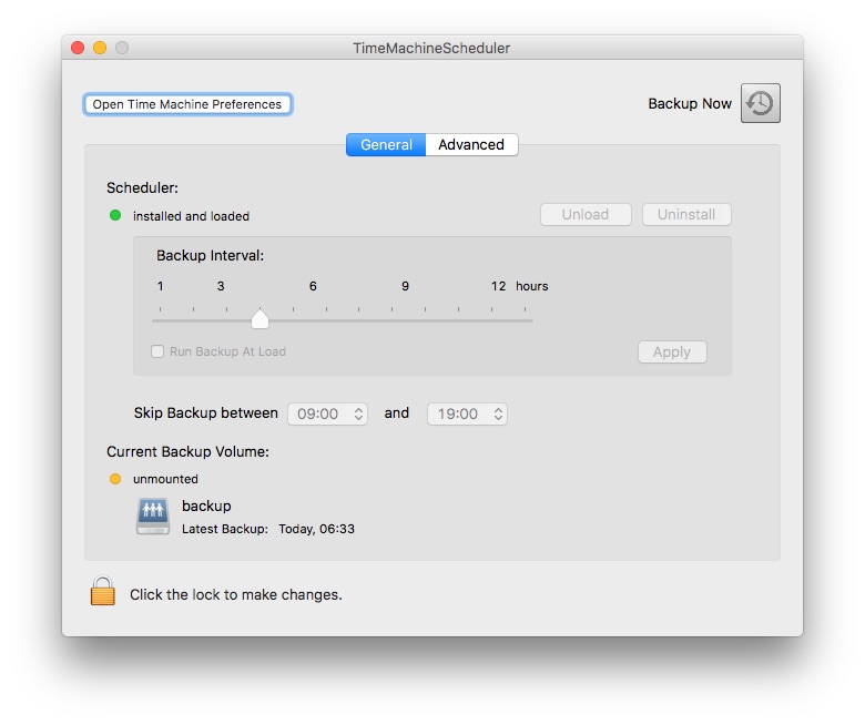
Looks pretty obvious, right?
Now consider that Time Machine Scheduler been around for nine years (since 2007), that there are more alternatives like it (some with fairly extensive options, like Time Machine Editor) and that Apple still hasn’t added a single extra control to Time Machine settings.
That, I think, says a lot more about Sierra than any of the improvements currently being touted – all you need to do is to have a need to use something in a sensible fashion, and all of a sudden you’re in a dark, forlorn corner of the OS that hasn’t seen any improvement whatsoever.
It’s just ironic that Time Machine is the one affording us that insight into the possible future of macOS.
-
This hasn’t always been the case due to Android’s schizophrenic take on the back button, but now that they’ve polished things a bit i find it a lot easier to use than the ridiculously tiny back arrow Apple added to the top status bar (which is, to boot, much harder to reach on a phone). ↩︎
-
Oh, you can pair some special “mice” that act like HCI devices (and use them with some apps like Jump Desktop), but that’s not true mouse support. ↩︎