or: “Throwing Sand In Our Eyes Doesn’t Make Things Better”
Ah, the joys of the silly season. While my RSS inbox tries to cope with the fallout from today’s Apple event, here’s my opinion, in a nutshell:
It was a rush job.
The .Mac makeover is not really an improvement (more on that below), and even though most components of the Mac experience were touched (software, hardware and services), there are plenty of signs that things aren’t quite properly finished.
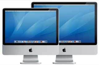
Sure, we now have glossy iMacs, and having only 20” and 24” does make things a bit simpler in many regards. But however pretty they happen to be, they are just… upgrades.

Nice upgrades, but upgrades nonetheless.
So let’s look at the rest:
iLife’08

First off, iLife’08. As it happens, I’ve been drafting a considerably long rant regarding the lack of iPhoto updates and checking out Lightroom for comparison – a piece which now needs some re-writing.
But the gist of it still holds – the metadata and color tools available in iPhoto ’07 are far too limited to be of any real use beyond a thousand photos or so, and even if performance issues get fixed, there is little or no evidence that the ’08 edition will do anything to improve things.
So what if it has fancier web publishing? That’s mostly a matter of templating (even if templating is beyond the ken of your average user, etc., etc.).
And Events feel like yet another tacked-on UI twist that provides little (if any) real improvement to the application. No sign of GPS metadata editing or Google integration, either.
In a similar vein, I can’t really say that iWeb seems any better. Yes, it’s meant to hide the intricacies of HTML from end users, but the last version generated crufty HTML code that rivaled the nearly legendary ugliness of FrontPage’s, and there are a myriad ways to add Maps and AdSense to a site.
Somehow, I just can’t see those as a “new feature”.
And yes, it’s a sure, impending sign of the “Aoogle” or “Gopple” mega-merger that people will ramble on about after the first pundit shrieks, hysterically, that Apple and Google are working together on web publishing…
It’s been a full year, people. Get a life – or, in your case, most likely an iLife
Like Gruber was saying on Twitter just now “Someone please tell me Pages 08 has decent style sheets. Because I don’t see it on the web site.”
Since there are no sample iWeb pages on show (yet), the jury is out. But I can’t say I’m expecting much.
And as far as the video apps are concerned, well… I don’t really do video, and I’d rather have decent Quicktime encoding and removal of all the absurd “pro” up-selling than umpteen new templates and direct YouTube upload, no matter how much nicer it is now.
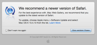
Oh, and the .Mac web gallery has got to be some kind of a joke – yes, it does allow you to upload photos via e-mail (finally, a feature I can use from a mobile phone), but, for starters, it tells me my perfectly good Safari 2.0.4 (remember, 3.0 is still beta) doesn’t quite cut it:

…even though 2.0.4 is the recommended minimum version to use .Mac services since Jul 31st (it’s listed on the .Mac login page as such).
Yes, I could upgrade to 10.4.10 (and I will, as soon as I figure it’s safe), but someone should grammar check that button.
“Use version I have” reminds me of User Friendly in entirely the wrong manner (maybe this was what Pitr was doing at Google, no?)
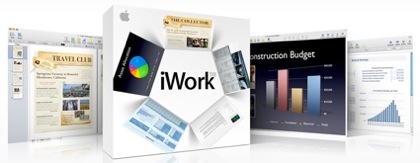
iWork

As usual, I went straight to Keynote, which now sports path-based animation – something PowerPoint already does with comparable flexibility (although probably not as smoothly) but nevertheless of dubious practical usefulness.
We also get an alpha editing feature that was sorely lacking, and the lack of which bit me the couple of times I actually tried to do a serious presentation on Keynote ’07, forcing me to run all my images through Seashore – but nothing more of note.
Pages, however, besides the alpha editing feature, gets mostly formatting and editing niceties. I can’t say that change tracking is much of a feature (given the way most people use it – or abuse it – in real life), but it doesn’t really seem like an upgrade – there just aren’t enough notable changes.
And we come to Numbers. Before people start harping on about how this is the “gloves off” edition of iWork (and therefore Apple’s new jab at Microsoft, etc., etc.), I would merely point out the following:
- Formulas (or formulae, take your pick) aren’t a highlighted feature. They’re buried in the tutorials.
And nowhere in the main examples will you see anything but simple maths and formatting niceties. Sure, it can probably do most of what Excel does in that regard, but that’s not its focus.
In fact, judging from the movies, the canvas works pretty much like the Keynote drawing tools (with a few extra dynamic alignment indicators reminiscent of OmniGraffle), and seems to be the useful feature.
Arbitrary column alignment is something I’d love to have in Excel, but not nearly enough to replace the rest of it.
So, in short, I’m still buying Office 2008 when it comes out. Go MacBU, make us proud – grind these toy applications into the dust.
.Mac
Okay, I can now strike one item off my copious list of .Mac shortcomings (or two if you conside r the mail-to-gallery feature, which is probably the first .Mac mobile tie-in).
We now have decent storage space: 10GB is something I can actually justify in terms of annual fee (maybe not at that price, but that’s another discussion).
There are, however, two things I’m still curious about:
- How long it will take for anyone to sync/transfer a significant portion of those 10GB (given the service’s pedestrian performance so far).
- How secure it is (do I still transfer everything over an unencrypted connection? Can I trust my documents to it?).
Since my account still hasn’t been updated, I can’t really say either way. I suppose enough people will question this to cast some light on the answers.
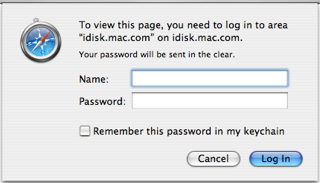
Update: Trying to access iDisk using a browser by clicking on it from my .Mac login page does not reassure me in the least:

And yes, if you manually change the URL to use HTTPS, it logs in securely (i.e., without sending your password in the clear) – and then promptly switches to unencrypted HTTP for browser access.
Now, wasn’t it only the other day that we had a noisy and public reminder of how just insecure web applications such as Gmail really are?
That and the insecure HTTP link on the login page are scary – they’re too big an oversight to reassure me that Apple is taking security seriously.
What do you prefer? 10GB and a chance for your password to be hijacked, or not using the service?
Me, I’m allocating as much as possible to my mail account – at least their IMAP servers use SSL properly.
The new Mac mini
While everyone is gawking at the (admittedly gorgeous, but unforgivably glossy) new iMacs, the mini is now a Core 2 Duo machine, and even more interesting as a home server.
More on this particular angle later. As it happens, I have another, Leopard-related rant that is closely tied to the mini.
Despite the persistent rumors that Steve doesn’t like it because it’s not an all-in-one device, I’d love to see actual sales figures for – many people prefer a small, cheap(er), inconspicuous computer to a large flashy one, and the mini is perfect for an office environment in so many ways that I keep wondering why Apple doesn’t market the things above board.
Sadly, I’m afraid that things are taking a turn for the “form above substance” side of computing, and that does not seem to be in the cards.
Their loss, I’d say.