A week or so ago, spurred on by a number of convergent factors, I embarked on an utterly unexpected errand: to acquire an Android device for myself.
The reasons were plain, and basically boil down to having something I can develop and test on at home - despite my current job regretfully having only tangential bearing on mobile platforms, I believe that computing as we now know it is effectively obsolete, with the future being inextricably linked to what we now think of as “mobile” platforms.
So, after pondering the issues for a while, I decided that I’d keep myself up-to-date as best as possible on my own time - and dime1.
Nitpicking
As to why or how a Mac and iOS user would actually go out and spend cash on an “inferior” platform, well… For the same reasons and mostly in the same way I deal with Windows or Linux - because I’m not a platform zealot and by hand-picking where and when I use them.
So I was especially picky about where I’d use Android:
- I wanted something that had the least possible amount of cruft, i.e., that was as close to vanilla Android as possible, given that every single vendor that has touched it so far has actually made it worse from a UI standpoint.
- I wanted something with decent enough hardware and build quality as not to be a royal pain to use.
- I wanted an upgrade path - the vast amount of Android devices out there are stuck two to three years behind the bleeding edge, but I’d like something with a sensible lifetime.
- I also wanted something cheap, given that the economy is going to go even further down the drain than anyone expected and my gadget budget is being re-scoped (unless there’s unexpected windfall, I won’t be getting a new phone this year, for sure).
Market Research
Strangely enough, these were not incompatible requirements. As I looked for ways to run a clean, fundamentally “bare” version of Android with just enough tweaks to be useful, I unavoidably came upon CyanogenMod, which a number of fellow geeks swear by2.
And as I perused their supported hardware list, I chanced upon an entry for the Nook Color. The Nook Color is a strange but wonderful beast, sporting a 1024x600 IPS, capacitive multi-touch display, an ARMv7 CPU that you can push into the GHz range, a GPU that supports OpenGL ES (useful if your OS can tap into it) and enough internal storage to make most other Android devices seem puny in comparison (most mid-range Android phones are plagued by asinine limitations on the amount of storage available to and for apps).
As to price, if you haggle a little, you might be fortunate enough to grab one off eBay for a sensible (sub-US$200) amount, making brand new tablets seem… silly. After having played around with a Galaxy Tab again, the 7” form factor seemed ideal, as long as coupled with a decent screen.
So getting one knowing it would run (and be supported in) CyanogenMod was, oddly, a lot more reassuring than shopping for, say, a Galaxy Tab or an Asus Transformer3.


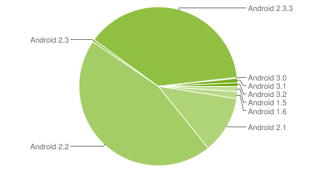
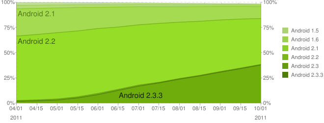
Plus Android 2.3 is currently on the rise as far as market share is concerned, and besides there being some experimental 3.0 builds for the Nook, I’m pretty sure that I’ll be able to get the basic Android 4.0 experience on it in the fullness of time.
Nooking
As to the hardware itself, the screen is astoundingly good (not retina grade, but good enough for a rewarding view of fine detail), and it is heavier than you would expect for its size but reassuringly so - although I am too used to holding a Kindle single-handedly to be an unbiased judge.
Getting CM7.1 installed was trivial (I’ve gone through far more convoluted procedures to perform official firmware upgrades on other devices), and I was soon fiddling around with it to my heart’s content.
Apps
Even a test device needs some. Besides Google’s own (and rather raw) Reader, the four other staple apps I’m using on Android are Evernote, Dropbox, Opera and Everpaper (an effective, if rather raw, Instapaper client).
It’s easy to rag on about Android having crummy apps, and I’ve had enough experience testing apps and devices to know that it’s even easier to criticize without even having tried to use them or understanding each platforms’ UX and overall flow, so I won’t go on about this other than pointing out two easily verifiable facts:
- Evernote on Android is brilliant (if quirky when you’re used to other incarnations).
- Everything else I’ve tried (including the official Twitter and Facebook clients) is, in a word, lame.
Seriously, it’s like time travel back to the days of iOS 3 - and it’s not as if some of these weren’t recently updated apps.
Fonts
Something that I’m still adjusting to from both a usability and development perspective is that typography on Android is atrocious, regardless of partisans’ opinions and vendors’ patchy attempts at shipping alternative (and always inconsistent) font sets.
The hitherto unexplained lack of even traditional staples (like Georgia, which I’ve adopted for my site due to its near ubiquity) makes it al the worse, especially if you intend to write content-oriented apps for it.
Truth be told, however, that patching the system font to use Roboto (Google’s new system font for 4.0) makes the whole OS much more pleasing (the uneven spacing and sketchy character shapes of Droid Sans get on my nerves, and I find it impossible to read long swathes of text in it), and that there is basic (if somewhat flaky) support for web fonts, so that will greatly alleviate doing web apps (or mixed native/web apps, which is my immediate goal).
Writing
It goes without saying that this was tapped out almost in its entirety on the Nook, but it should be noted that it was somewhat of a chore despite my being familiarized with both the standard Android soft keyboard and the numerous bastardized variations unleashed upon unsuspecting users by hardware vendors trying to “improve” upon it4.
The form factor is the biggest problem for me, since I find it impossible to use a soft keyboard on a 7” tablet in anything other than portrait mode, and even then thumb-typing on Android feels slower than on my iPhone or iPod, not due to the keyboard or dictionary but to the rather gauche selection and editing UI.
I can type properly on my iPad (i.e., with multiple fingers) in both landscape and portrait, but the Android keyboard is harder to use on landscape than the iPad’s on portrait, and tapping to select, copy or paste is much slower and finicky on Android than on iOS.
Getting Stuff Done
I won’t even go there, given that what I’m trying to get done on it so far is a set of proofs of concept for an app, but suffice it to say that so far I’ve stayed well clear of the calendar and resorted to Evernote to make notes and draft to-dos when I’m lounging about with it or doing tests.
Development-wise, my eternal loathing for Eclipse and the JDK have, of course, reached new heights, but I’m trying to work around that.
As to the rest, well… It’s early days yet, and I’ve got a long way to go before I have a good enough app running on both iOS and Android.
-
After all, given that I shored up my technical skills even while doing Marketing stuff, I should be able to keep fiddling with mobile tech regardless of what I do next - not to mention that it’s driving me crazy not to be able to do mobile-related stuff in earnest, so this is a mild palliative. ↩︎
-
Their project organization is an object lesson in itself, and if you’re a developer, you’ll love their internal development setup. ↩︎
-
Not to mention that it was somewhat ironic knowing that I would be contributing to the piles of unsold stock I heard some local retailers complaining about. ↩︎
-
Yeah, you can replace input methods and customize them up the wazoo - I don’t care about anything but the core experience, although I do have Graffiti installed for one-handed - and short - input) ↩︎