The iPod Touch, launched on 2007-09-05, is Apple’s attempt at providing a non-mobile alternative to the iPhone, originally made infamous for the removal of all editing ability from the calendar until firmware revision 1.1.2.
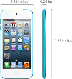
Upgraded to an 8Mpx camera, new color options and “modern” specs (except TouchID) on 2015, it had been previously revamped in 2012 to match the iPhone 5:

It was upgraded to a high-res 960×640 pixel display and a set of front and back cameras on 2010-09-01 and slimmed down a bit:
!specs_dimensions20100901.jpg!
(disassembly
The first refresh version launched on 2008-09-09, with iPhone 3G styling, volume controls and a speaker:
p=.
!Image2.jpg!
(disassembly
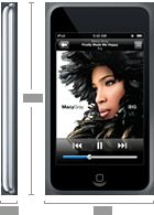
The original version:

Notes on the early revisions:
Good Points:
- Now finally includes an e-mail client (as of firmware rev. 1.1.3, although it was considerably lame of Apple to demand early adopters to pay up for this)
- Much thinner than an iPhone
- Metal back
- The Skyhook location feature works in Lisbon. Creepy.
Bad Points:
- No Bluetooth support for audio or for dial-up networking via a decent phone (fixed on later revisions)
- No speakers on the original version. There’s a piezo clicker, but it would have been nice to have had a simple speaker for showing videos and stuff without resorting to the earplugs from the get go
- Everyone I know with the original model complains about short battery life (and I do too)
Owner Info:
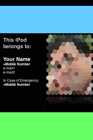
Since the device has no support for an “Owner Info” screen, I created a wallpaper specifically for that purpose, using measurements gleaned from iPhoneMinds:

Feel free to change this for your own purposes in any editor that suits your fancy and sync it to the device. Besides a photo, there’s plenty of room for contact information.
Some design notes:
- Helvetica Bold works very well for phone numbers, making them very readable.
- The colors were chosen to work well with the tinted overlays from the clock and slider:
- The top becomes a neutral, informational navy blue
- The bottom turns into a mossy green that reinforces the point that it’s how you gain access to the device
You can, of course, fool around with coloring to suit your own tastes, but gradients are, in general, a bad idea – the tinted overlays will mess them up, and in this case you want the text to be readable under pretty much any conditions…
Bugs:
| Issue | Description |
|---|---|
| “#5748499”:Radar:5748499 | Hidden/Protected Web Gallery Albums are inaccessible on iPhone and iPod Touch – the Mobile Safari redirects are broken for hidden albums (you can get there, but only by manually tweaking the URL) |
Resources:
| Date | Link | Notes |
|---|---|---|
| Sep ’10 | iPod touch review | Engadget’s detailed review. |
| Older | Guided Tour | |
| Walt Mossberg’s Review | ||
| Features Guide | PDF link |
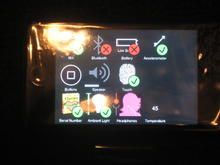
Here’s a shot of the factory diagnostics screen (via Engadget):
