 Rui Carmo
Things are moving really quickly as I prepare for a long(ish) absence for paternal leave, and following the lead of dock workers everywhere, I’m keeping my head down and glancing up frequently in order to keep track of metaphorical tonnes of really heavy stuff moving overhead.
Until I have some breathing room (a relative notion considering that I shall be cook, nurse, clown and hairdresser - among others - to a pair of little imps), I’ve put a bunch of things on hold, and fooling around with my iPhone was one of them.
Which, of course, doesn’t mean I haven’t upgraded. But iOS 4 hasn’t been that much of a change for me - given that my main device is still the 1G iPod Touch, I’ve only used it during the week’s commutes.
But I must say that even with the benefit of an entire months’ worth of testing the developer build on a separate phone (albeit without my data and apps), it hasn’t made much of an impression.
Live fast, die young, leave a nice UI
In a nutshell, my battery runs down faster, app groups and e-mail threading are nice, the spell-checker finally fixes a number of irritating typos in Portuguese, and the unified inbox is rather less useful than average to me (I prefer to keep things separate, and I don’t like having to scroll down to the accounts list to go into mailing-list or project folders).
Not to mention that I keep wondering when we’ll have a native To-Do/task list app - given that we can now sync both calendars and notes over the air, the least Apple could do is sort out what their take is on To-Do lists.
It’s all quite speedy, though1.
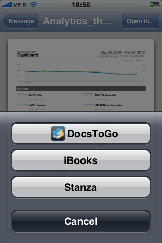
The only weird glitch so far was that Stanza broke PDF attachment handling in e-mail - all PDFs were rendered as inline images, and although I fixed it temporarily by removing the app, the only seemingly permanent (and non-drastic) fix was resetting all settings to defaults inside Settings > General > Reset (no, you don’t need to backup and restore your phone).
However, that then revealed an interesting bug:
So yeah, you might not want to upgrade until 4.1 rolls out, especially because the difference in terms of battery life is very noticeable.
The iTunes ball and chain
On another note, I am still underwhelmed by the archaic, borderline senile iTunes syncing experience and its arcane inner workings - it took forever to backup my phones before upgrading, I still can’t manually manage my media or apps from any computer (something that becomes that much more important when you add documents and e-books to the mix), and having to plug in my phone to sync is barbaric (to say the least).
Heck, no, it’s not just barbaric. It’s an insult to anyone who has used any other modern mobile phone, and more so to the bucketload of people who have been using iSync over Bluetooth for nearly half a decade.
I’ve ranted about this before (several times, in fact), and there is simply no excuse for the mess that we’re in in where it regards syncing what is supposed to be the best, most intuitive mobile device on the planet.
Contrasting the iTunes slow as molasses syncing experience, its confusing UI sporting a bucketload of tabs and the need to use a specific USB cable with other devices I have (where I can sync stuff over Wi-Fi to my computer - any computer, by the way - or just drop in files to standard USB storage using an industry standard cable) makes the iPhone / iTunes setup seem not merely hopelessly archaic, but (and this is the bit Apple should care about) utterly lacking in both usability and gratification.
Come on, it’s 2010 and I’m using a cable to move stuff across and at a quarter of the effective speed I get on other devices, because it takes forever to accomplish the simplest of tasks using iTunes, whereas on other devices I just toss over the files and I’m done.
At this point in time, using iTunes to manage an iOS device is neither intuitive nor efficient - it’s a chore that we go through because there is no other option, and the cluttered and inconsistently restrictive UI is worse than just letting people manage files directly on onboard storage.
Whereas I can hand over my Samsung phone to anybody and ask them to take out or drop in photos and media and they’ll just do it, attempting to do the same with an iOS device is a one-way ticket towards trouble and frustration for all concerned.
And although the glitches and battery life aren’t applicable to the iPhone 4, all of the above is - which is a shame.
Don’t lick your phone
Oh, and regarding the iPhone 4 antenna woes, it’s not really news. Any device will suffer if you ground its antenna (or bridge it to another, similar antenna using a nice, fleshy, conducting material that is nearly 70% saline solution, like the base of your thumb).
My personal bet is that we’re going to see a minor revision with another notch on the bottom right side to leave a dead metal section along the bottom, once they sort out the structural changes (it is, after all, what holds the guts of the device together).
Or maybe there will be a bumper sale. @:)@
Either way, I’m still holding out to see what the next iPod Touch revision will have for a screen - I can’t justify blowing enough cash to pay for an iPad and trimmings on something I only look at for a few tens of minutes every day (and I’m not too happy about the current iPad having half the RAM and a worse screen than the iPhone 4, either).
But I’m definitely going to look for alternatives to using iTunes regardless. It’s just plain wrong.
-
You will notice that I make no mention whatsoever of multitasking - that is not just because it isn’t really multitasking or that I couldn’t care less for any feature that will impact battery life, but also because I find the current app switching method rather gauche - something like a swipe across the top status bar or a pull-down notification/taskbar combo would be a lot more usable (and maybe even more accessible) than a double-click on a single, already overloaded button… ↩︎