Oh well. Someone had to be the first to use this post title, I guess.
Anyway, after generally pampering myself by using Tracks and managing to get my act together on it, I decided that maintaining an HTTP daemon (even if such a lightweight one as Ruby's webrick) for organizing myself wasn't the right way to go, and I decided to look at what I had available right there on my desktop.
As it turns out, I've become (again) sort of a network computing case study - for the past week, I've been living inside Citrix both in and out of the office, and despite my missing one or two applications, having a consistent/persistent environment makes one hell of a change.
Outlook Good
And, of course, I use Outlook inside it. I've never stopped using Outlook at the office since it replaced Microsoft Mail, and despite the fact that it is easily one of the worst-looking applications of all time (only surpassed by the hideous, confusing and distracting junk that the next version calls Command Tabs), it still knocks the socks off most other similar applications (including Evolution, which only matches Outlook in bloat).
Now, I've already mentioned that Mail.app ought to take a few hints from it where it regards message lists, and I'm not kidding. Outlook slices and dices data in a way most other productivity applications can't match (except Notes), and I decided to take advantage of that for my new GTD scheme.
So, How Do I GTD?
As usual, I thought about what I wanted to achieve first:
- Painless task entry and editing. That was paramount, since the main lesson I learned from using a number of tools over the years is that entering the tasks is the one thing that really grinds down my efficiency.
- Tasks ought to be easily grouped by Project, Due Date, Context, etc. on demand.
- An easy way to filter out private tasks (for reporting)
- An easy way to print out a report of what I've been doing for an arbitrary time interval.
- It had to be minimally compatible with my Blackberry (which doesn't show all Outlook task fields).
- It had to be usable if all I had was a browser (i.e., via Outlook Web Access).
Custom Views To The Rescue
The first four were pretty trivial, actually. All it takes is to create a custom view in the Tasks folder with grouping, a "new item" row, etc., etc.:

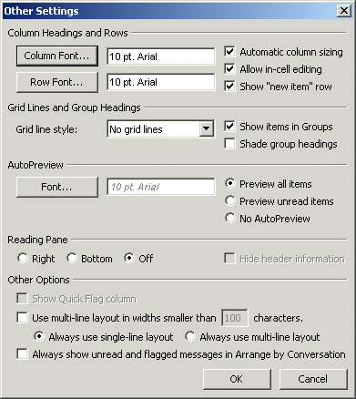
Note the "Allow in-cell editing" flag, which lets you click around as if it were a spreadsheet (save for notes, more on that later).
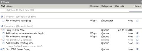
After a few font tweaks to ensure it printed well (which took care of the reporting), it looked like this:

And what does this do?
- All I need to change the view is to click on a header - Outlook automatically groups the tasks by project, context or date.
- It's filterable and usable as a report - I just cloned the view, set a filter to hide private items and it was instantly printable as a structured table.
- Outlook also records completion dates, strikes out completed tasks and highlights overdue ones in red.
I can also create more views to list only completed tasks with completion date, print out reports for those, etc., etc.
What's That "Company" Thing, Then?
The real trick was in picking the right Outlook fields to go with it. Yes, you can add whatever custom fields you want to a folder, but I wanted something standard (so I could be sure it would have a chance of being ported across to other devices), and decided to stick with standard fields whatever the cost.
Oddly enough, Outlook has absolutely no notion of "Project", let alone "Context", so I thought a while about how I do things and realized that I often pick up tasks from other contexts when I've emptied my stack, and that some tasks are context-independent.
So it makes sense for me to file some tasks under multiple contexts (since I might be able to do them in many contexts), and even to move them from context to context as I re-schedule my time.
What's In a Name?
And what does Outlook have as a standard multi-value field? Why, categories, of course. A task can belong to as many categories as you want, and you can re-assign it to another category by dragging it and dropping it inside a grouped view.
Plus the field is actually usable in my Blackberry (using Blackberry Enterprise Server 4.x), in the sense that I can view and change a task's category and that the Blackberry also supports multiple categories - including filtering by category.
So that was set. Finding a suitable field for "Project", though, was a bit tougher. I eventually settled on "Company", which for some reason (I suppose it is for billable time tracking) is visible and editable on the Outlook Web Access UI.
It's not visible on my Blackberry, but then again, I don't need to see the project name on it - I have it set to only display the tasks belonging to the "@mobile" category, sorted by due date (remember, context is key, and you don't want to get sidetracked by redundant stuff in your task list).
I suppose other people would prefer doing it the other way around (using categories for projects, and probably using the same category names they already use for other stuff in Outlook), but, again, for me a task only belongs to one project, whereas it might be doable in multiple contexts.
The Relevant Bits
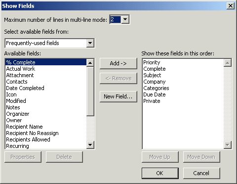
Anyway, here's the actual field listing for your enjoyment:

Regarding task notes, I am using the AutoPreview feature (another thing that is sadly missing from Mail.app, but which Outlook can use just about anywhere), and notes are the only thing that isn't directly editable in the view.
Which is just as well, since I tend to write copious notes, so using the standard task editing window is fine with me. Outlook then displays the first three lines in the AutoPreview, and I can always toggle the preview pane if I need to read all of it.
And that's just about it, I guess.
Reality Check
Now, you must realize that this isn't as polished and magical as Kinkless GTD.
Outlook, despite its acknowledged power and flexibility, feels like an Iron Age axe next to OmniOutliner's polished smoothness and Ethan's clever AppleScripting, and doesn't do any magic - you have to click for it, and figure out next tasks by yourself, etc., etc.
But it has built-in reminders and is usable by anyone on a Windows box. Plus this layout isn't at all complex to set up and use and, thanks to the custom view mechanism, almost infinitely tweakable to your needs - especially the filtering and reporting.
And if you really want to, I guess you could use Visual Basic for Applications (brrr) and script it a bit.
But remember, my main reasons for doing it this way are:
- It's based on something I have to run/have installed anyway
- It syncs to my Blackberry
- I kept it real simple as to not get in the way
...and having a cell-editable view of all my tasks is a major boon.
Furthermore, it's usable from my Mac and Linux (thanks to Citrix, obviously, which I realize isn't an option for most people) and, with luck, will also translate well to other mobile devices (besides the Blackberry) and anything that can talk to Exchange.
Sadly, Entourage users are out of luck, since Microsoft decided not to implement access to Exchange task folders and roll their own local task database instead. I've yet to see if the 11.2.3 update (which was just released, with Spotlight support) fixes this, or if we'll have to wait for the next version...
Any way, I wish you happy GTDing, even if you have no choice but use Windows.