Today’s a bank holiday, so I decided to spend a little while having fun. As it happens, yesterday I came across this neat “Now Playing” desktop display build, and since I have an official 7” Raspberry Pi LCD on my desk for controlling my lights, I decided to do something similar, but to display what’s currently playing on Plex (since I use PlexAmp on my Mac or Windows laptop to listen to my music collection).
As usual, things got slightly out of hand, because:
- I wanted to have both my Echo Listen or PlexAmp update the display
- The display defaults to showing my office dashboard, and I can’t just take it over (or waste it on a single purpose)
- The display turns off every few minutes automatically, and it needs to come back on to display the album art
- I wanted it to be pretty
This meant talking to the Node-RED instance that runs the display, customizing the dashboard to include tailored HTML and CSS and delving a bit into the Plex APIs.
The Pretty
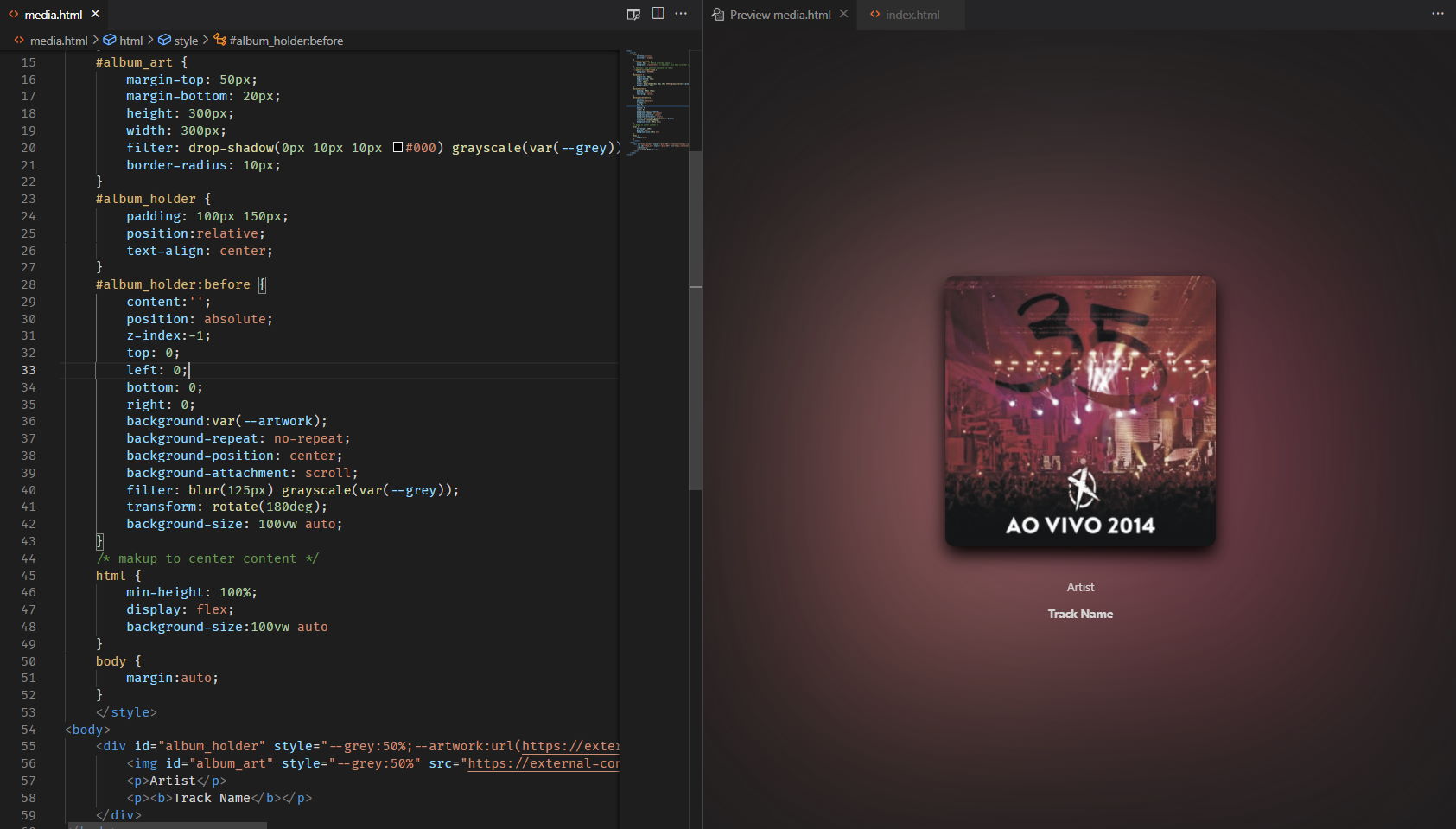
The first part was laying out the UI, which I quickly mocked up in VS Code:

Pro tips:
- Rotating the cover art 180o before blurring it and sticking it as a background gives a very nice look (and saves you one HTTP request for another image, etc.).
- Using the
:beforepseudo-element can be both friend and foe. - Set the cover art width to
auto(unlike shown) and you will also be able to show movie posters and the like (if you want to) - For extra polish, I also designed this so that I could set the
--greyCSS variable when playback was paused (which, alas, I had to give up on)
The Good
With the UI mocked up, I decided to get started on how to actually tap into Plex. Since I wanted to update Node-RED and everything else in the house already speaks MQTT, the way forward was obvious, and it took me all of 60 lines of Python to build a simple MQTT relay for Plex playback events.
And since it’s a 12-factor app deployed on piku, you can even call it a microservice:
from functools import lru_cache
from json import dumps
from os import environ
from sys import exit
from plexapi.base import PlexObject
from plexapi.client import PlexClient
from plexapi.server import PlexServer
from time import sleep
import paho.mqtt.client as mqtt

MQTT_BROKER=environ.get("MQTT_BROKER")
PLEX_SERVER=environ.get("PLEX_SERVER")
PLEX_TOKEN=environ.get("PLEX_TOKEN")
BASE_URL=f"http://{PLEX_SERVER}:32400"

server = PlexServer(BASE_URL, PLEX_TOKEN)
broker = mqtt.Client()
broker.connect(MQTT_BROKER)

def fetchItem(key):
    global server
    i = server.fetchItem(key)
    return {
        "key": key,
        "type": i.TYPE,
        "art": i.art,
        "thumb": i.thumb,
        "thumbUrl": f"{BASE_URL}{i.thumb}?X-Plex-Token={PLEX_TOKEN}",
        "artist": i.grandparentTitle,
        "album": i.parentTitle,
        "track": i.title,
        "rating": i.userRating,
    }


def on_message(client, userdata, message):
    global server
    if "plex/rate/" in message.topic:
        key = message.topic.split("/")[-1]
        try:
            key = int(key)
            i = server.fetchItem(key)
            if i:
                if not(message.payload):
                    i.rate(None)
                else:
                    i.rate(float(message.payload))
        except Exception as e:
            print(e)
            exit(-1)
    elif "plex/player/" in message.topic:
        player = message.topic.split("/")[-1]
        try:
            for c in server.clients():
                if c.machineIdentifier in player:
                    cmd = str(message.payload)
                    if "skipPrev" in cmd:
                         c.skipPrevious("music")
                    elif "skipNext" in cmd:
                        c.skipNext("music")
                    elif "pause" in cmd:
                        if c.isPlayingMedia(False):
                            c.pause("music")
                        else:
                            c.play("music")
        except Exception as e:
            print(e)
            exit(-1)


@lru_cache(10)
def findClient(identifier):
    global server
    for s in server.sessions():
        for client in s.players:
            if client.machineIdentifier == identifier:
                return {
                    "client": client.title,
                    "product": client.product,
                    "device": client.device,
                    "platform": client.platform,
                }

def dump(alert):
    global server, broker
    if "playing" in alert["type"]:
        n = alert["PlaySessionStateNotification"][0]
        key = int(n["key"].split("/")[-1])
        state = n["state"]
        alert = {**alert, **fetchItem(key), "state": state}
        c = findClient(n["clientIdentifier"])
        if c: # Plexamp provides information, but Alexa doesn't
            alert.update(c)
        broker.publish("plex/playback", dumps(alert))

try:
    server.startAlertListener(dump)
    print("Listening for events.")
    broker.subscribe("plex/rate/#")
    broker.subscribe("plex/player/#")
    broker.on_message = on_message
    broker.loop_forever()
except Exception as e:
    print(e)
    exit(-1)
Update: I’ve since added touchscreen support for previous/next track and pausing.
There are a few bits of weirdness in the APIs, though, largely because not all Plex clients are well behaved:
- While I can figure out when something is playing on PlexAmp and from which machine, playing music from my Amazon Echo Listen gave zero information on the client (even then, I cached those calls to save time).
- PlexAmp also sends out “paused” events regularly, which the Echo Listen doesn’t – so I had to forego my nice greyscale look for when music was paused.
So your mileage may vary quite a lot here.
The Bad
Then I had to get my HTML to work inside the Node-RED dashboard, which is awesome if you want to build control panels but a hideous Angular nightmare full of sharp corners if you want to do something pretty (I really wish they switched to Vue).
Injecting something into the dashboard layout controller is… hard, especially if you’d like to overlay it across most of the screen and customize navigation. I spent the most time fighting with the built-in CSS and Angular’s DOM handling, but it sort of worked:

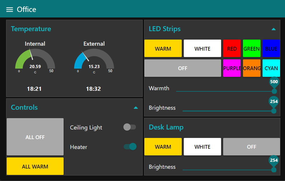
I had to compromise a bit in terms of layout (including preserving the tab bar background color), at least for the moment, but at least I can hop back and forth to my dashboard if needed:

The Ugly
However, the really hard bit to figure out (and which was also a bit of a nostalgia trip back to when we hacked X terminals in college labs) was how to get Node-RED to turn on the LCD backlight again.
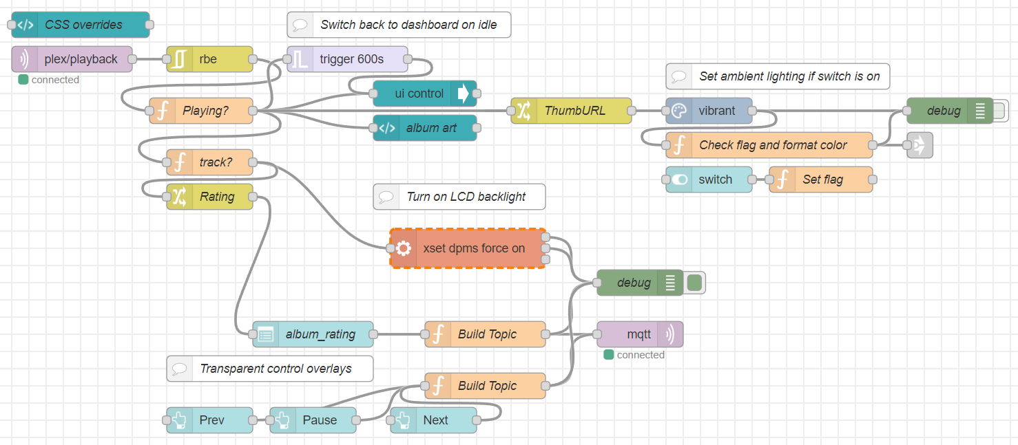
The overall flow logic is pretty simple, really:

xset to work.- Listen to the
plex/playbacktopic and de-duplicate it, which gives us only the new events we are interested in - Render the HTML template (the CSS is injected in a similar node elsewhere since I have other customizations)
- Tell the dashboard to temporarily switch to the Now Playing tab (the trigger node switches it back to the default one after a timeout)
- If it’s a music track, turn on the display using
xset, since the display is DPMS enabled and blanks out on its own.
The really tricky thing was to remember how to get xset to work for Node-RED to turn the display on, since Chrome and the X Server runs as the pi user and Node-RED runs under the piku user, and I didn’t want to do the crass thing and just xhost + so anything could access the X display.
I eventually got it to work by explicitly allowing piku to access the display in the autostart script, by using +SI:localuser:piku as arguments to xhost:
$ cat .config/lxsession/LXDE-pi/autostart
@unclutter -idle 0 -root
@xsetroot -cursor_name dotbox
@xhost +SI:localuser:piku
@sed -i 's/"exited_cleanly": false/"exited_cleanly": true/' ~/.config/chromium/Default/Preferences
@sed -i 's/"exit_type":"Crashed"/"exit_type":"Normal"/' ~/.config/chromium/Default/Preferences
@chromium-browser --noerrdialogs --kiosk http://127.0.0.1:1880 --incognito --disable-translate --disable-infobars
That man page diving session took me a lot longer than I expected, since these things are just not done on a daily basis anymore.
Update: A Few Days Later
I ended up needing to inject an insane amount of CSS into Node-RED to get things to look the way I wanted (not just doing away with the navigation bar, but getting the album art to look right and to add transparent controls for rating tracks).
It took a lot of finagling with transparency, position: fixed and z-index to get everything to look just right:
#album_art {
    margin-top: 50px;
    margin-bottom: 20px;
    height: 320px;
    aspect-ratio: 0.92/1; /* allow for slight LCD distortion */
    width: auto;
    filter: drop-shadow(0px 10px 10px #000) grayscale(var(--grey));
    border-radius: 10px;
    z-index: 0;
}
#album_blur {
    padding: 10px 100px;
    text-align: center;
    position: relative;
    margin: 0;
    z-index: -1; /* make sure it's back */
}
#album_blur:before {
    content:'';
    position: absolute;
    top: 0;
    left: 0;
    bottom: 0;
    right: 0;
    background-color: transparent;
    background-image: var(--thumbUrl);
    background-repeat: no-repeat;
    background-position: center;
    background-attachment: scroll;
    filter: blur(75px) grayscale(var(--grey));
    transform: rotate(0deg);
    background-size: 100vw auto;
    z-index: -1; /* make sure it's back */
}
/* Slight tint to ensure text is readable  */
#album_tint {
    margin: 0;
    padding: 0;
}
#album_tint:before {
    content:'';
    position: absolute;
    top: 0;
    left: 0;
    bottom: 0;
    right: 0;
    background: linear-gradient(0deg, rgba(0,0,0,1) 0%, rgba(0,0,0,0.8) 70%, rgba(255,255,255,0) 100%);
}
#album_info {
    position: relative;
}
#album_info p {
    mix-blend-mode: hard-light;
    background: none !important;
}
/* Try to get rid of dropdown background and dashboard colors */
md-card.album_art_holder {
    top: 0;
    background: none;
    background-color: transparent !important;
}
md-card.album_rating {
    z-index: 9;
    background: none;
    background-color: transparent !important;
}
#Now_Playing_Holder_cards {
    position: fixed;
    left: 0;
    top: 0;
    right: 0;
    height: 64;
    z-index: 2;
}
#Tab_Now_Playing {
    position: absolute;
    top: 0;
    bottom: 0;
    z-index: 2;
}
#Tab_Now_Playing::parent::parent::parent > md-toolbar {
    background: transparent;
}
/* Ratings dropdown tweaks */
.md-select-value, #Now_Playing_Holder_cards,
#Now_Playing_Holder_cards > md-select-value {
    background: none !important;
    border: none !important;
    border-color: transparent !important;
    border-bottom-color: transparent !important;
    text-align: center;
    margin-left: auto;
    margin-right: auto;
}
md-card.album_rating > md-input-container > md-select > md-select-value > span.md-select-icon {
    display: none;
}
md-option > .md-text {
    margin: auto;
}
/* Get the toolbar out of the way */
#toolbar  {
    z-index: 3;
    width: 30%;
}
/* Make tap overlays transparent */
md-card.invisible, md-card.invisible > button {
    opacity: 0;
    background: none;
    background-color: transparent !important;
}
md-card.clear, md-card.clear > button {
    background: none;
    background-color: transparent !important;
}
But it was totally worth it:

I also changed the logic quite a bit, including an option to set my ambient RGB lighting according to the highlight colors in the album art:

All that is missing is still some animations (the Pi running the dashboard is a 3B+, so it’s not the sharpest CPU on my desk, but it should be able to do fade-ins in Chrome…).
But for a couple of hours of fun during a holiday and a couple of evenings, I think that’s OK.
Thanks to Jason Tate for the inspiration.
Update: A Year Later
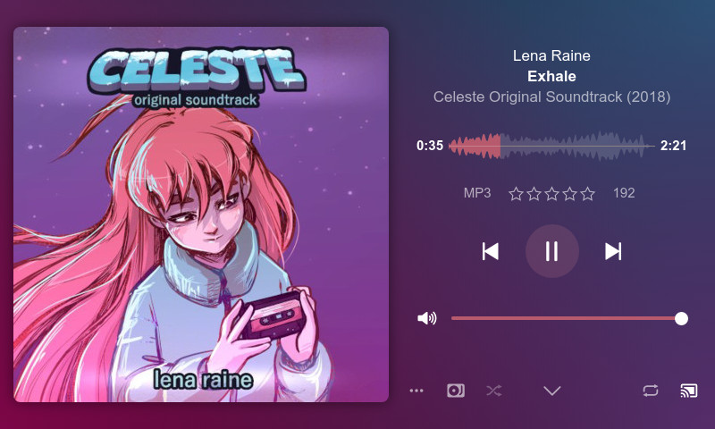
Come December 2022, I decided to try to squeeze PlexAmp into the 512MB confines of the Pi 3B+ my dashboard is running on, and surprisingly enough, after upgrading to Raspbian 11 and Node 16, the thing actually ran and the web UI is usable (slow, but workable) on the touchscreen display:

Furthermore, Chromium is touch-aware, so I can swipe from left to right to go back in history. So I added a link to the Now Playing display for https://localhost:32500 to open the full PlexAmp UI, and I can just swipe back to my dashboard to control lights and heating at will.
A key thing here is that having PlexAmp running locally is just icing on the cake – the Now Playing display also works when I’m invoking Plex from Alexa or anything else in the house, so it’s useful on its own (and also provides quick access to pause/skip on a much lighter web page).
Also, since I also have shairport-sync installed and both can now coexist, I have been poking at the idea of having the display show metadata from AirPlay as well (with partial success already), so that’s another fun rabbit hole I might drop into on a separate post.