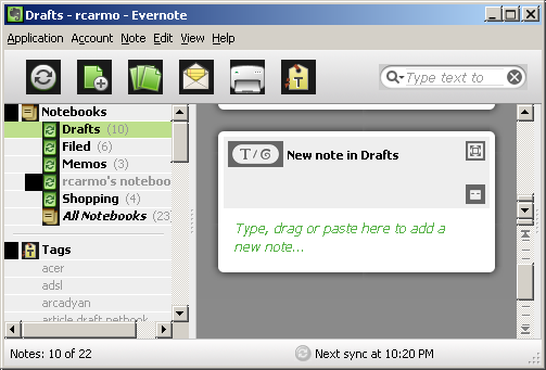
Update: Merely 24h after I wrote this, there’s a new Windows version available that improves performance a tad (even under WINE). Sadly, the UI still follows the same approach, and actually looks much uglier under WINE. Here’s a shot of it with the new toolbar:

After a few days of using the new iPhone version with favorites/offline support, I think it’s fair to say that Evernote has finally become useful to me.
I still don’t think its entry-level offering is secure enough for professional use, but I find it good enough to draft random bits of stuff in.
My sole woe right now is that its Windows version has the grace and UI styling of, well, a rather sluggish green elephant. Whereas the Mac version is sleek, fast and has a sensible UI layout that showcases most of the features (even if it doesn’t do client-side OCR), the Windows version has a “river of notes” view that I find fiddly and aggravating to use - after you’ve used the Mac version, everything pales in comparison.
So much so, in fact, that I sometimes prefer to just use the web interface on Windows, something I only usually did on my Linux netbook1. Speaking of that, by now most people know that Evernote will run mostly OK under WINE or Crossover Office2, albeit with some visual quirks - if they had a couple of options to remove the gradients and use a “flat” toolbar, it would be just dandy.
Still, it’s nice to have options. I personally see no point in a fully native Linux port of Evernote with my current setup (and the company has stated that they will be publishing an API for third-party programs to talk to their platform, which should prompt someone to write a native client for the GNOME desktop), but on other platforms things seem to be shaping up.
I’m not sure if it’s really the best note-taking application out there (and I should point out that I use OneNote for all the sensitive stuff, so I can readily compare the two), but at least now it’s sort of working for me.
-
It bears mentioning at this point that their Web UI, despite very polished, wastes far too much vertical real estate to be truly useful on the current crop of 1024x600 LCDs that most netbooks use - something that could readily be fixed by using a pop-out note editor (a fairly simple development, I think). ↩︎
-
Which, incidentally, I got a free license for, but that regretfully seems to be only moderately better than the stock Ubuntu WINE for my (very casual) use. ↩︎