Having just come across Thunar (via Xfce Diary and an odd Python-related Google search), I was struck by how fragmented file management UIs have become these days.
I am one of those people who is alternately aggravated and gratified by Nautilus' spatial mode, but being exposed to several different operating systems (plus variants on desktop environments), I have developed a rather personal (and likely controversial) view on this sort of thing.
The Not-So-Good Old Days
The first graphical file browser I ever used was not a Mac, but the age-old GEM, which I used on an unnamed CP/M box, then on an Atari ST and, later, on an Amstrad 1512 (yeah, that old XT piece of junk).
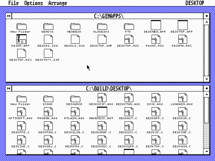
It wasn't that hot, and when I got my hands on a Mac (around System 6.0.2), I immediately took to the Finder's vastly improved spatial layout. However, once you start doing any sort of real work, you start needing a quick, effective way to zip through folder hierarchies, and let's face it, the Finder's outline view wasn't that good:
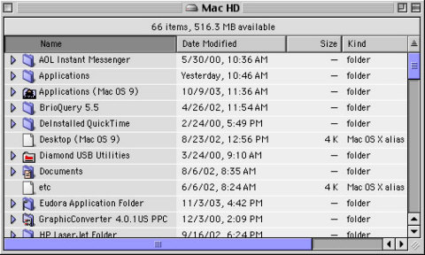
Every time you expanded a folder, you completely lost track of items at the same level - which was a pain when you were laying out a complex DTP project and had to keep track of placeholder artwork and final artwork simultaneously.
In Praise of Column View
In fact, I never found a decent way to handle hierarchical navigation until I got my hands on a NeXT and came across its file browser:
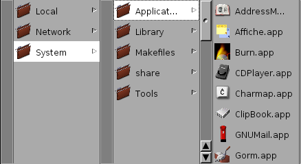
You may recognize it as the precursor to Mac OS X's Finder column view, which admittedly has looked far worse than it does today:
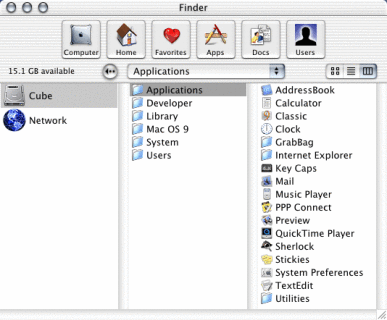
Of course, today's Finder has an entirely different layout (the "shelf" has been replaced by favorites on a sidebar and the path is now a smaller button), but it's essentially the same thing as the NeXT file browser:
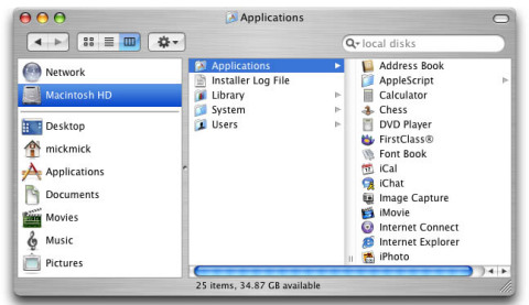
Column view (together with the Finder's drill-down handling of file drag and drop) has since become my all-time favorite approach for file management, largely because it allows me to easily double back to higher levels in the folder hierarchy with ease.
And besides being a very compact hierarchical display that helps me maintain focus on the set of files I'm working with, it's also an intrinsic representation of file browsing history, since you tend to stick to the same part of the folder tree.
The Forest And The Trees
It is usually around this point that file tree proponents step in and point out both Nautilus' file tree and Windows Explorer's classic approach. Well, I happen to hate file trees largely due to the very same reasons I don't like the Finder's outline view:
- Expanding tree items usually hides items at the same level (which get pushed downwards)
- Tree expansion is slow (especially in recent versions of Windows, or when using a network filesystem)
- The tree usually expands sideways as well, causing scroll bars to appear and making it harder to make sense of the tree layout (how often have you been forced to scroll a tree view?)
In a nutshell, tree views are a bad trade-off between ensuring the user has a fixed reference point (the tree root) and easy navigation.
This becomes readily apparent in Windows Explorer, which was never able to do tree browsing responsively and which compounds the problem with its current emphasis on bloated "task panes" along the left-hand side of windows (one of the first things I switch off).
File Soup
GUI purists will likely step in and say that inexperienced computer users prefer spatial mode (since it allows humans to use mostly the same set of neurons that allows them to misplace their car keys only occasionally) and that users don't necessarily want a hierarchical filesystem, etc.
We've been there before, and I happen to agree with both of those views - especially on things like PDAs, where I think filesystems are totally unnecessary (remember the original Newton and early Palm models?).
But this is my view on things, and it's what makes me more productive.
I (as well as most experienced computer users) need a hierarchical filesystem to stay organized, and the blunt fact is that nothing better has come up in the past decade - categories, tags, whatever you call them, have failed to make significant impact in file organization, and search probably isn't going to have much of an impact either.
So It's a File Browser Now?
Of course, acknowledging the fact that people needed a different way to navigate the filesystem (and taking advantage of both navigation history and people's acceptance of internet browsing), developers took the next obvious step, and we got "Browser Mode", complete with back and forward buttons.
However, I find "Browser Mode" (or history windows) to be of less interest to me than column view, because (as I pointed out above) column view is an intrinsic visual representation of both your current location and a portion of your navigation history, and when you work in a hierarchical workspace, most of your navigation history falls inside the same tree anyway.
Paths vs. Columns
Of course, you don't actually need the columns themselves. For instance, Thunar uses a set of path buttons (in exactly the same way than the standard Gnome file chooser), which is (at least to me) a far better approach than Nautilus' half-baked path popup:
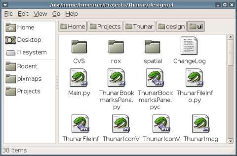
And, of course, it uses folder shortcuts just like the Finder, so I'm all for it becoming the new Gnome file manager once it's stable.
To Infinity And Beyond
Of course, there's a lot more to consider when looking at file management, and Mac OS X's Finder could use some improvements itself - for instance, a lot of people swear by PathFinder, which adds a path button bar and an amazing amount of enhancements (although I personally never felt the need to try it):
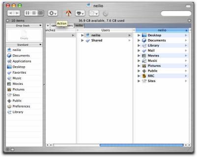
As to other, more common platforms, I would personally love to have something for both Windows and Linux that provided the same functionality as the Mac OS X's Finder column view.
There's GWorkspace, of course (which, incidentally, is included in the GNUstep Live CD), but I would rather have "native" implementations of the concept on either platform - skinned file browsers are not my thing, I like to have a consistent look and feel on whatever platform I'm using.
Incidentally, it should be fairly trivial to do a Windows column file browser using standard file views and splitters to build the columns - I took a stab at it myself once (back in my Visual C++ days) and any competent .NET programmer should be able to do it trivially.
Hmmmmm. Must fight... urge... to do it... myself...