 Rui Carmo
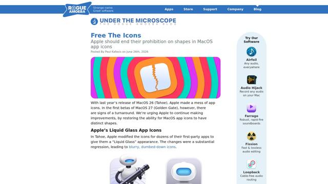
I, too, find the squircles aesthetically offensive and utterly pointless. Tahoe didn’t just dumb down Apple’s own icons, it dictated the shape of everyone’s, shrinking any icon that refused to conform into an ugly grey cell–icon jail for the crime of having a silhouette. Decades of distinctive Mac icons flattened into bland uniformity, and the usability argument is the one that really stings: shape was a way to tell things apart at a glance, and now it’s down to colour alone (good luck with that if, like me, you often can’t readily distinguish Slack from Photos).
What I yearn for is the era when an icon had room to be something distinctive, with enough real estate to carry a bit of personality. Golden Gate walking back the worst of Liquid Glass is encouraging, so maybe the people inside Apple who clearly know this was a mistake will find it in themselves to fix the rest.
The part that genuinely breaks my brain, though, is that I now find icons on Linux more distinctive than on macOS, which would be impossible for my ten-year-ago self to believe. The platform that built its reputation on craft and visual identity has spent a year sanding it off, while the one everyone used to mock for its inconsistency is where individuality survives. Funny how that goes.