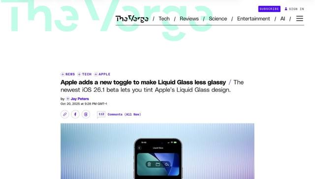
Apple will never acknowledge how badly Liquid Glass failed as a design concept, but at least they’re trying to make it more usable. And this time they’re not even trying to disguise it as an accessibility feature, it’s actually a top level setting that should never have been needed in the first place.
Well, if you can’t fix it then flaunt it, I suppose.
All I need now is a “kindergarten mode” toggle to deal with the five different corner ratios and extraneous whitespace in macOS Tahoe windows, and someone with critical thinking skills overseeing their UX team. Maybe that would finally convince them to abandon this entire “design by committee” disaster.
