 Rui Carmo
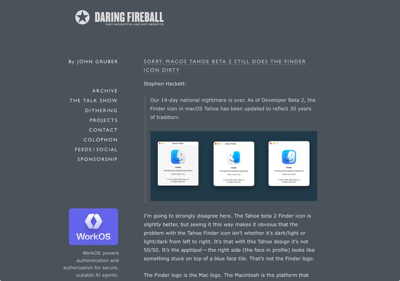
I agree with John on this. Sometimes designers want to make their mark so bad on a project they go and gloss over either tradition, established branding or earlier styles that were there for a reason, and the updated Beta 2 icon still does not look like the Finder to me, even if I squint at it without glasses.
Design systems are usually created with a bunch of fluffy “rules” that verge on hyperbole, and this feels like the result from one of those “creative” processes. I bet there is a Figma page someplace with a list of design principles that says something like “an outline for visual demarcation of the icon’s key visual, allowing whitespace to define its boundaries” or some such nonsense.
Just stop fucking with the Finder icon, guys.