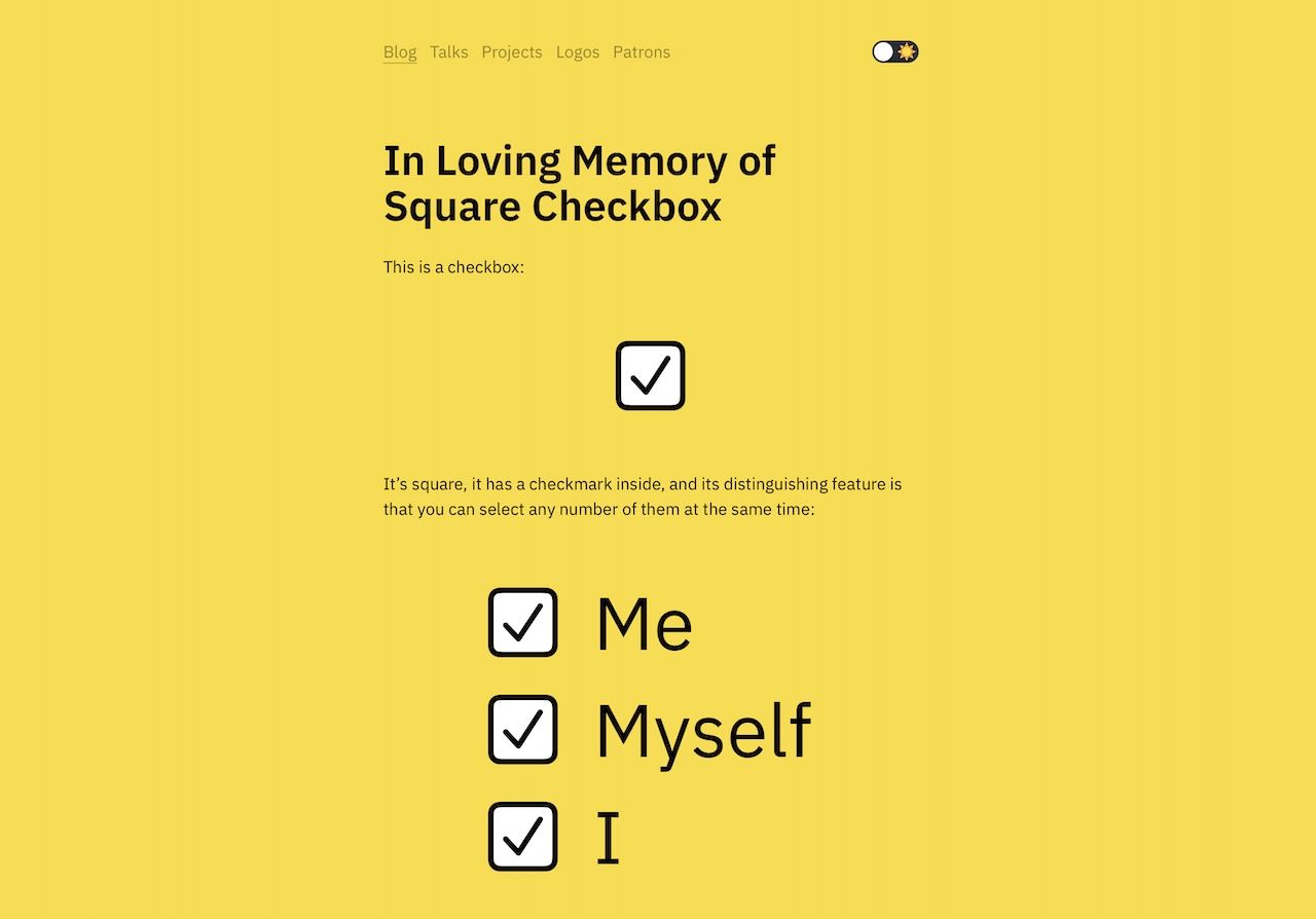
This is madness. Madness, I tell you.
I remember reading Tog On Interface back in the day1 and thinking that Apple had the ultimate grasp of UI design, and their using round checkboxes these days is just… plain… wrong.
-
This was back when I was in college. It took me forever to be able to buy my own copy, and it is one of the most treasured items in my bookcase. ↩︎
