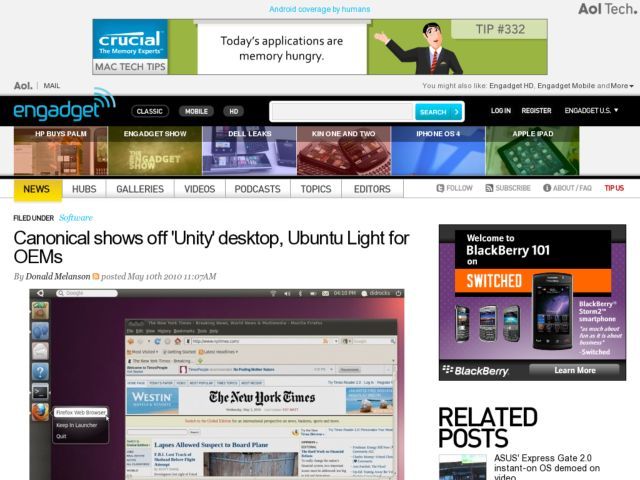
All this time to make it look just like OSX but with the colors reversed, the wrong button order in window controls and the obvious giveaways of sticking the functional equivalent of Spotlight and the dock (complete with “keep in dock” option), on the left. Way to innovate, guys.
Update: Ars Technica reviews the current release (10.04), which is somewhat less frilly, besides having a feature on Unity (ooh, look, they copied Exposé as well).
