 Rui Carmo
Against my better judgment I went and installed iPadOS 26 Beta on my M1 Pro iPad, and… it’s a mess.
Seriously, I don’t know what Apple was thinking, but this is a regression in usability that I haven’t seen since the early days of iOS.
So why did I install it? Here’s my (not necessarily valid) rationale:
- I’m going to have to use it anyway
- It’s summer, and there is a certain amount of ennui that goes with the season
- Despite being my “better” iPad, the M1 Pro has not managed to dethrone my iPad Mini 5 (it is still the non-laptop device I use the most, anytime, anywhere), so if something breaks, it won’t be much of an annoyance
So this Friday afternoon I took the plunge, and spent a solid four hours going through everything and taking notes.
First Impressions
Right off the bat, the “feel” I got wasn’t very positive:
- Everything feels much slower (and this is an M1 Pro)
- Even trying to turn off animations didn’t help (“reduce motion” doesn’t do anything for window animation delays, and turning on cross-fades really shows that Apple has the animations set too slow)
- In particular, the window opening animation gets old really fast and is much slower than on any other Apple device I have (including my iPhone 15 Pro)
But the thing that really got to me was seeing (and trying to use) the new design choices. I’ve been using iOS since the first iPhone, and I have never seen this kind of regression in usability.
Design
I am not a fan. It’s not really about Liquid Glass, but more about the blatant and gratuitous waste of screen real estate across the board. And I am really afraid that this is going to be the new normal, especially since I’m seeing similar things in macOS Tahoe– and if there is one thing that I like in macOS, it is that it has had (until Sonoma, at least, where title bars got too fat for comfort) a decent balance between aesthetics and efficient use of screen real estate.
So it is no surprise that the biggest and utterly unavoidable issue I have with iPad OS 26 is that windows now have much rounder corners that not only look butt-ugly but, most importantly, waste a fingertip’s worth of screen real estate–at each corner.
Additionally, controls are gratuitously rounded and roomy, and things like Safari’s “title bar” are just plain hideous since it literally gets in the way of content in the most distracting way possible and some elements have inconsistent shapes and heights.
Running windows snapped to the top of the screen looks horrible–for instance, in Safari you get some pretty excessive white space atop the URL field when running it snapped to the top of the screen, presumably for rendering the menu bar when the mouse hovers over that zone.
I am also definitely not a fan of the new menus–they are overly rounded and, again, look like they were designed by a 12-year-old, and I assume they too were sized to cater to fingertips (although in Safari going through the History menu quickly reveals inconsistent and randomly-sized entries).
As to Liquid Glass itself, I’ve found it to be wildly inconsistent (it’s not applied everywhere, and at first I thought I had some Accessibility setting toggled on). It’s a random readability hazard, and not really appealing aesthetically.
One particular issue I have with it is that when scrolling around in Photos around half the time toolbar buttons are rendered completely unrecognizable because they will be caught in some weird state between light and dark.
It’s just bad, and I can’t really find anything positive in the visual redesign.
Windows
Of course the first thing I did was to plug my iPad into my aging LG Ultrafine and repeat the experiments I did years ago with Stage Manager, which revealed a bunch of issues:
- The dialog to choose the windowing mode feels like a hack, and the Control Center toggle to turn Stage Manager on/off has become a press-and-hold toggle that is just plain confusing the first time you try to use it.
- The classic macOS-like semaphores feel like a useless, stunted quasi-placebo. Minimize and close don’t mean the same thing on an iPad, and Apple should own up to that.
- Their “minified” state means they are slow to use–it takes either three clicks or nearly three seconds to get to the window layout overlay.
- Worse, the semaphores tend to drift to the center of the title bar (next to the app menu) instead of sticking to the corner, which is not just annoying but makes them useless.
- There is still no way to move windows around with just the keyboard (other than closing them). Update: There is, but you need an Apple keyboard with the “globe” key.
- Using Command-Tab to switch to another app if you have a full-screen window in the background causes the target window to literally fly off the left side of the screen for no apparent reason instead of just moving forward in the window stack, which is maddening.
- Swiping from the corners seems to be incompatible with the Éxposé gestures (but taking a screenshot by doing so with the Apple Pencil fortunately still works).
But, overall, I have to grant that the new windowing mode is an improvement–I no longer have to play hide and seek in Stage Manager, or have to reposition windows constantly, even if the new Éxposé feels clunky.
I do like the new mouse pointer (which actually lets you point at things, even if the liquid motion the former “bubble” had was nice and consistent), but the current window and title bar visuals are just bad, and I submit as cardinal evidence what happens to the clock in light mode:

The same thing happens to the battery icon, making it nearly impossible to actually know how much you have left without tapping it or switching to some place where it has more contrast.
Oh, and by the way, this beta drains the battery a lot faster than anything I’ve run before on this iPad, so I don’t recommend installing it if you rely on your machine for anything serious.
System Apps
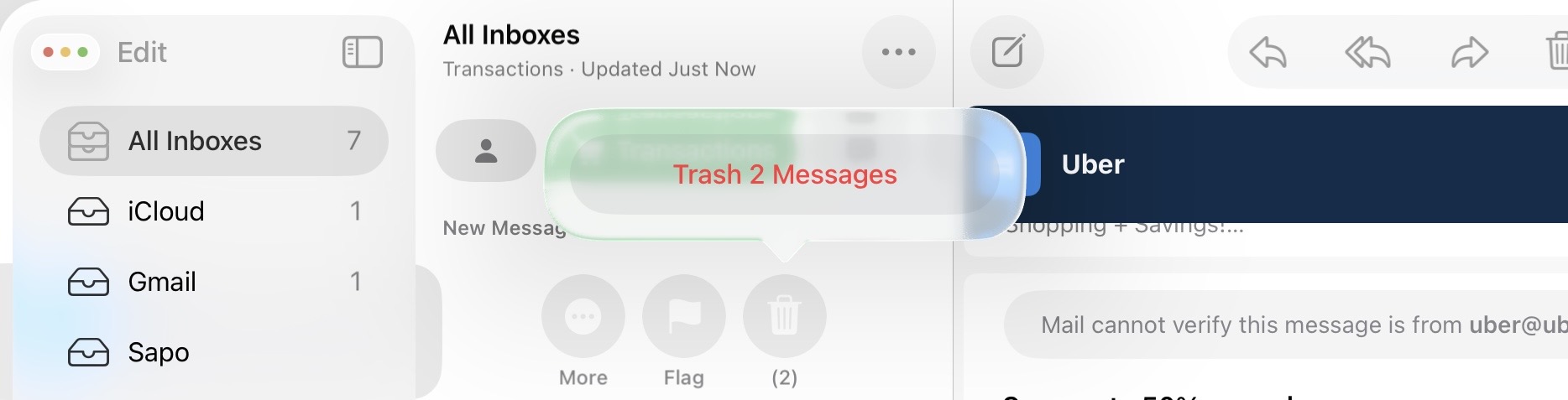
I’ve already used Safari as an example, but I am deeply, deeply saddened by what is happening to Mail–besides all the windowing issues I described above, the inbox category buttons and message preview headers are garishly colored and feel unnecessary, breaking the smooth whiteness and understated design it used to have.
And the interaction model… Look at this hideous confirmation button floating inside Liquid Glass:
Messages seems overly eager to launch dedicated chat windows at the slightest provocation, which I’m going to assume is a bug (a single tap on a conversation shouldn’t trigger that), but otherwise works, although it too suffers from overly rounded UI elements, slow animations, and spurious shadows.
Settings now tries to be helpful when you search and displays “quick picks” when you tap on the search field, but the actual search functionality is still completely useless—you still cannot search for a subsection or by a sentence or word you know is somewhere in its labyrinthine depths, and the animations feel wonky.
Freeform seems to have been left untouched, and I couldn’t see any traces of Liquid Glass. On the other hand, Photos is crawling with it to the point where it becomes visually messy, but thankfully now defaults to the Library grid view instead of a screenful of “organization” that nobody really wanted.
Photos is also now lightning fast in scrolling through photos with the keyboard, which only highlights how badly Apple chose the default animation timeouts—the M1 Pro is still very snappy, but Apple’s design and interaction choices are crippling it.
The newcomers (Phone, Preview and Journal) work, and I expect to get a lot of mileage from Preview, but they’re not exactly exciting.
Things That Are Shamefully Broken
Then there are the things that might be sort of OK on a beta but that I think should never have made it out to a public one:
- Holding Command to get an overview of an application’s key bindings (one of the features I used the most) has apparently vanished without any suitable replacement.
- Using Command-Tab to switch to an app that is in another screen will “hang” the app switcher and leave it in the middle of the original screen, obscuring the apps you were using.
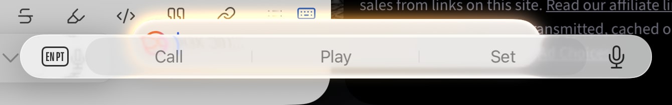
- And, finally, hitting Globe-S to invoke Siri often causes the text completion to overlap it:
Conclusion
It’s only been a few hours and I must grant that this is the first public beta, but right now I would rate this an 8/10 in terms of functionality, a 6/10 in terms of UX (those damnable animation timeouts have to go) and a 4/10 in terms of design and usability–with a sizable risk that macOS Tahoe will be comparatively worse.
The only app that has repeatedly (and consistently) crashed so far is WhatsApp (which, let’s face it, isn’t a good sign given how important it is), but no apps seem to be fundamentally broken and I can use Remote Desktop and SSH just fine to reach out to other machines, so the iPad is nominally usable for me and I’m going to call this a controlled win.
I’ll be playing with Shortcuts and Apple Intelligence next, and I’m very curious to see what it’s going to do to my battery—and patience.