I’ve been blissfully (nearly) offline for a few days, and it’s been great to actually not use computers except those inextricably attached to TVs.
But I do have a couple of personal projects I want to fiddle with, and as it happens one of those took an amusing turn towards nostalgia.
I will eventually get some actual results out of it, but at least I had a bit of harmless fun.
The Classic Experience
A couple of weeks ago I themed GNOME on Fedora to look like modern macOS as part of my Remote Desktop sandbox do-over, but Infinite Mac popped up while I was doing it and I started wondering about whether it would be feasible to have a more lightweight desktop experience that looked like pre-X Mac OS (which I used for many years).
After all, before that I had been happily using Window Maker as a lightweight desktop (which was why I tried NEXTSPACE a month ago), but I’d never really bothered with recreating the Platinum UI.
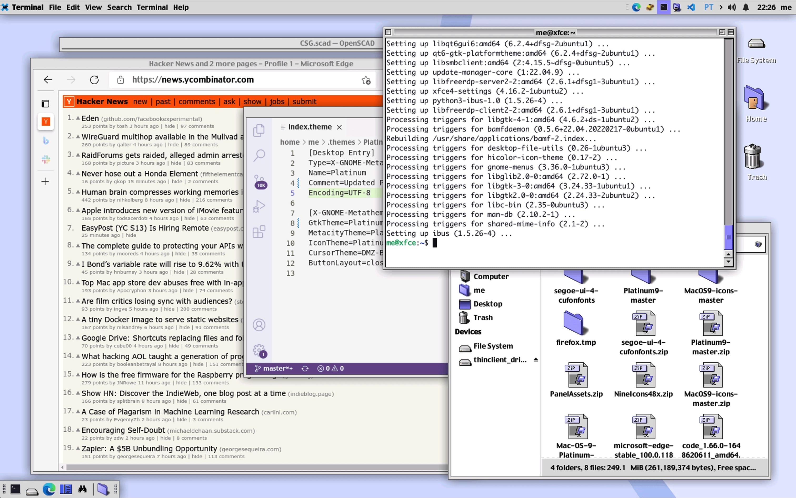
So a couple of hours after that post, I had already dug around a bit and had something that looked very much like this, but without a top-level menu or extra panels:

This was an intriguing rabbit hole to dive into and is actually pretty usable, but it might be a short-lived affair for a number of reasons:
- Most themes I found were for ancient Linux desktop environments (mostly pre-GTK3), and there don’t seem to be any good window themes for contemporary window managers (save
xfwm, which is hardly modern). - The “shade” behavior is just not the same (nor are the title bars, widgets, etc.). Things are just ever so slightly off, and firing up Infinite Mac completely blows away any notion that the above looks anywhere close a “real” Mac.
- UI widgets are also off, but the scroll bars are pretty much on point.
- “Charcoal”, the Chicago-like font, almost looks the part but you need to squint really hard.
- In much the same vein, there aren’t any “real” Mac OS 9 Classic icon themes out there–in fact, the theme packs I found mixed Windows 95 icons with Mac icons, which look horrible.
- There is zero provision for HIDPI displays, scaling or any
2xresources of any kind, so this looks minuscule on my 5120x2160 monitor.
So if someone wants to take this up as a “labor of love” for modern Linux distributions, they have their work cut out for them–and I’d suggest opening Infinite Mac, firing up ResEdit and going to town on system files to collect some decent icons first.
But the good news is that it looks amazing on a tiny LCD display I’m toying with, so I will actually have a use for it.
A Side Note On Ubuntu 22.04
Another reason this is likely to be a short-lived affair is that since this was a throwaway container, I decided to run the bleeding edge jammy distribution, which was already available as an LXD image.
As usual, here’s a list of some of tweaks I did:
DEBIAN_FRONTEND=noninteractive apt update && apt install xfce4 xfce4-terminal xfce4-appmenu-plugin avahi-daemon qt5ct qt5-style-kvantum qt5-gtk-platformtheme qt6-gtk-platformtheme
vim tmux htop xrdp openssh-server fonts-inter ttf-mscorefonts-installer
adduser me
sudo usermod -aG sudo me
update-alternatives --set x-window-manager /usr/bin/xfwm4
update-alternatives --set x-default-session /usr/bin/xfce4-session
update-alternatives --set x-session-manager /usr/bin/xfce4-session
update-alternatives --install x-terminal-emulator /usr/bin/xfce4-terminal
Oh Snap, Firefox!
This also let me have a look around at the internals of the new Ubuntu user land, and it seems OK, despite the rather senseless idea of installing Firefox as a snap.
I’m not going to belabor a point that is already contentious, but my take is that it makes for a horrible browsing experience with very poor desktop integration, and as a direct consequence I just disabled snap and installed Microsoft Edge instead…