In an attempt at compensating for not writing much (if at all) about work, I decided to share some throughts about spending a good portion of my weekend running Azure Databricks, which for those of you who are allergic to branding is a fully managed Spark service on Azure.
I used it on a few customer engagements this year and there is plenty of wide-eyed “data estate transformation” literature out there mentioning it, but I thought a level-headed, pragmatic take would be of general interest, and it makes for a nice change from all the DevOps and container stuff I’ve been doing for the past few weeks.
Background and Motivation
I started fiddling with Spark in earnest back in 2014 (which is when it reached 1.0), and at the time I was looking for something that could replace Hadoop, or at the very least the relatively messy combination of pig and Hive we were running atop SAPO’s Hadoop cluster.
I spent a fair amount of time learning how to run Spark fully standalone on “bare metal” and getting it to work with Jupyter on my own dinky little cluster, but by that time I was already in the process of moving on from the Big Data team and starting to do public cloud benchmarks (which is why I ended up at Microsoft).
First amongst the things that drew me to Spark even then was its in-memory processing, which coupled with the near-trivial Python interop and the ability to run both with and without HDFS made it seem a really interesting fit to some of the things we were doing.
In comparison, Hadoop’s computing model always felt bloated and slow no matter how many other animals people added to its menagerie, and Hive was absolutely lousy as a database. I am aware there are nicer alternatives these days and I hear good things about Impala and Phoenix, but I only come across them when troubleshooting customer setups.
But somehow, those solutions never seem to be a good fit for the problems being tackled (hence the troubleshooting), nor have I had meaningful discussions about why those specific components were picked – in fact, most of my customers (and partners) who use Hadoop seem to be running it “because it’s the open standard” and sometimes only to run Hive1.
Spark’s Superpower: Decoupling Compute from Storage
So I despair a bit when there’s this perfectly good (in fact, excellent) solution that can run atop HDFS (and YARN) but which is fundamentally different from Hadoop because it allows you to full decouple compute from storage.
You can run Spark as a YARN/Tez job on Hadoop using HDFS as storage, but you can also run it outside Hadoop and point it to HDFS, raw disk, Azure Blob Storage, S3, etc.
Whereas data nodes in a Hadoop cluster have to be on 24/7 to provide redundant HDFS storage (usually with a replication factor of three), Spark can be pointed at just about any kind of (often cheaper) storage, upon which it gleefuly proceeds to snarf what it needs into its own nodes to build its internal Resilient Distributed Datasets, run your code, and then toss back the results, all the while doing as much as possible in-memory.
This is tremendously useful in public cloud environments like Azure where storage is a core service that is paid for on a per-use basis, and effectively means that you can dynamically fire up a Spark cluster on top of a large data store to do heavy computations for a few hours, tear it down, and spend a lot less when compared to running just about anything 24/7.
Sadly, most people coming from on-premises scenarios take a while to figure this out. In particular, it always fascinates me when a customer is running Hadoop on the cloud as IaaS and insisting on storing all the data “inside” the running cluster. It’s not just the wasted computational power, though; those data nodes are effectively burning cash, since (at least on Azure) the virtual disks they run on are already based on redundant storage2…
What Databricks does is manage the whole thing for you, including setting up and tearing down compute nodes. You’re only effectively paying for the compute clusters you fire up and their live use of storage (active volumes in the cluster and transactions against external stores) and the service manages Spark setup and configuration dynamically, including resizing the cluster depending on load.
A Practical Example: Hey Taxi!
One of the staples of data engineering is the NYC Taxi dataset, which is provided by the New York City Taxi and Limousine Commission and consists of trip record data going back to 2009.
I decided to use it to put together a working example that I will be presenting at an event soon because:
- It is absolutely perfect for handling with Spark.
- It’s so vast and full of intricate little details that you can slice and dice it in a number of ways without getting bored.
In fact, I like to use bits of it every now and then for training machine learning models (“what’s the probability of a rider tipping when being dropped off in such and such location?”), but the whole thing is about 300GB of raw CSVs that have mostly the same schemas depending on cab type and year–but not really, and cleaning it up is a sort of recurrent hazing ritual for Big Data folk as technology progresses.
Think of it as a kata for data engineers, if you will. Cursory internet searches will uncover dozens of scripts to download, clean up and import it into a bunch of different data stores3, but every time you come across a new data store or processing engine you end up having to (re)do a lot of it yourself (like we did a year ago for a SQL Data Warehouse demo), and it’s a chore.
Fortunately, I had the opportunity to re-use a few Spark notebooks put together by Franck Mercier and tweaking them a fair bit. That still entailed a few hours of importing missing months, updating some code to fit my needs and (this was the fun bit) converting to Parquet everything since 2009 instead of just a few years, because it can be sliced into time series data and good sample datasets of that are hard to come by.
Since I wanted a specific schema for the final dataset I ended up doing it twice this weekend, but the overall process goes something like this:
- Import the whole thing into an Azure storage account (I had to do part of this manually for July 2017 onwards)
- Convert both Yellow Cab and Green Cab CSVs into homogenous schemas (fortunately Franck had nice, readable Scala code that did this already)
- Dump those dataframes into Parquet files (again, back into the storage account)
- Build a materialized view spanning both cab types
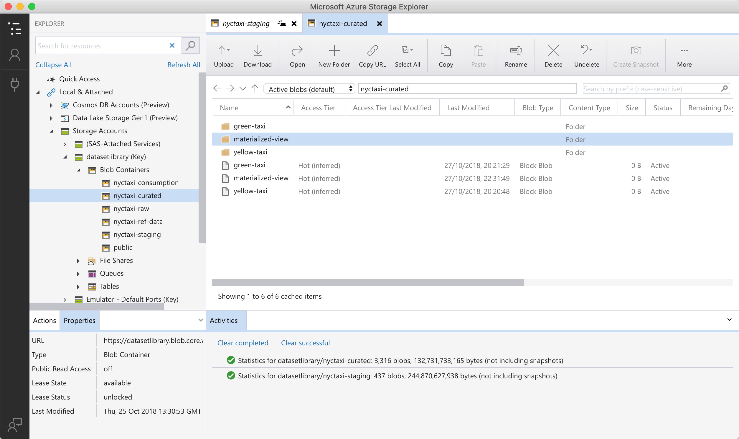
The result is a set of Parquet files that is roughly 140GB in size, at an estimated 1.9x compression rate:

The really fun bit, though, was running the actual conversion and realizing that Databricks started scaling up the cluster automatically by both adding entire nodes but also adding disk space as the Spark RDDs grew.
It’s always sobering to realize that all of a sudden the 32 core machine you started out with has five new buddies, and a lot of fun to watch the job progress bar move at a fair clip as it wades through hundreds of millions of records, but watching the event log list the disk resizing events was a bit surprising, since it speaks to the level of detail Databricks goes to and makes perfect sense considering how Spark works when it starts running out of RAM for its executors.
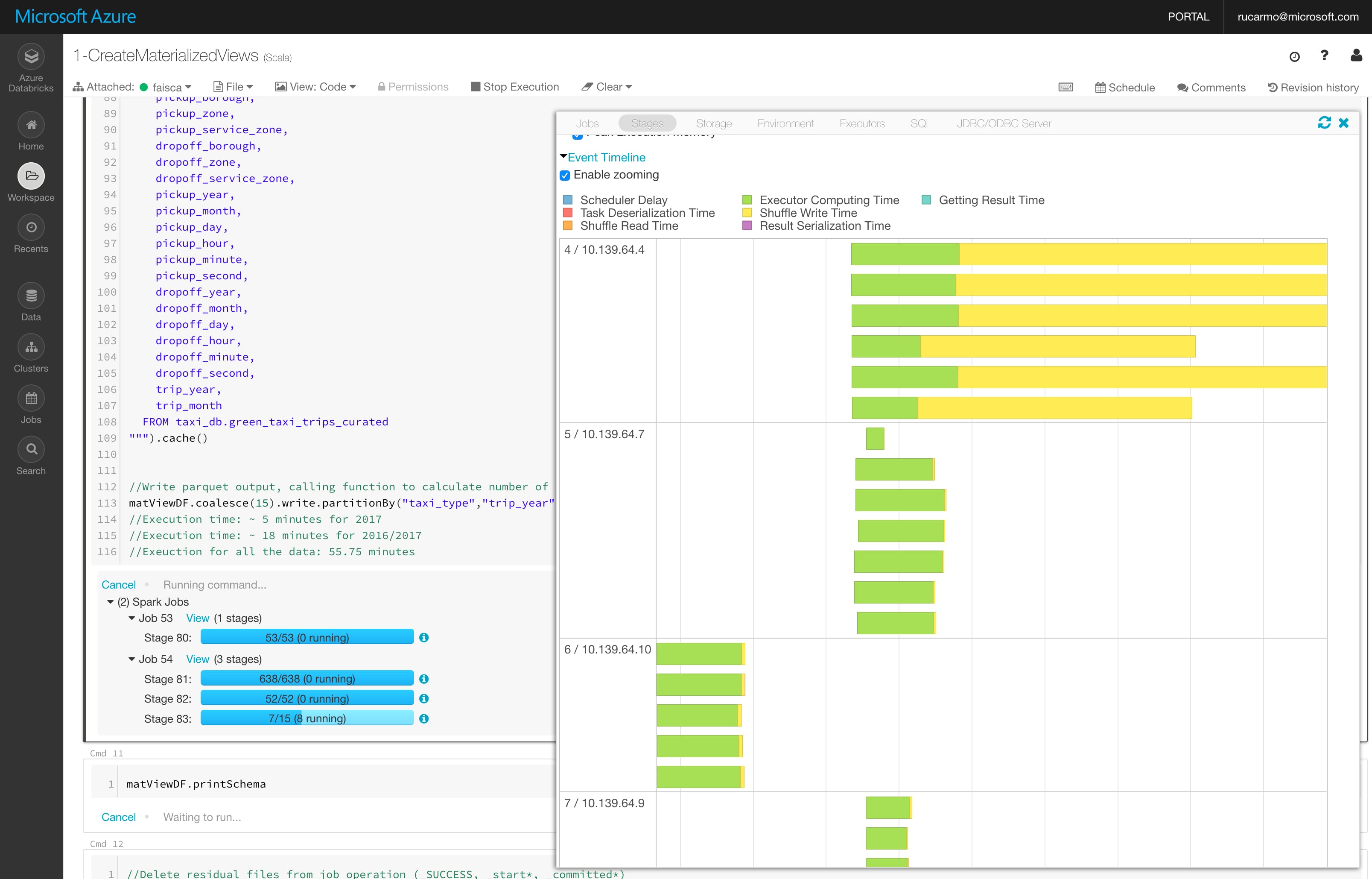
Integration-wise, Databricks is a great environment–besides the overall workspace and cluster setup UI, the notebook environment has a number of nice touches that harken back to the Zeppelin user experience, but with an extra level of polish. For instance, I can drill down into job details by just clicking on then, and it seamlessly takes me to the native Spark UI to view the executor graph and timeline:

Workspaces can have multiple clusters defined (you can, for instance, have a big cluster with 32-core machines for temporary heavy processing and a smaller 4-core, 2-node one for 24/7 operation), and they can also be multi-user (with Active Directory authentication and granular access control to both notebooks and clusters).
Plotting Taxi Domination
Now that I have all of the data neatly stored in Parquet (which as of tonight represents 1.422.437.469 yellow cab and 64.406.676 green cab trips–I didn’t get around to add Uber and Lyft yet), I’m poring over it and looking for ways to accomplish a few things I want to do.
And as a way of getting a deeper feel across the entire dataset, I decided to do some visualizations (which, incidentally, are another reason this dataset is quite popular).
In particular, I picked up Max Woolf’s 2015 post (which had been sitting in Pocket for all these years) and decided to do his location count query for dropoffs instead:
%sql
CREATE OR REPLACE TEMPORARY VIEW dropoffs AS
SELECT ROUND(dropoff_latitude, 4) AS lat,
ROUND(dropoff_longitude, 4) AS long,
COUNT(*) AS num_trips,
SUM(fare_amount) AS total_revenue
FROM taxis
WHERE trip_year="2015" AND fare_amount/trip_distance BETWEEN 2 AND 10
GROUP BY lat, long
Since location data was removed from the dataset in later years, I had to stick to 2015. I also decided to use matplotlib instead of ggplot and tweak it in order to render the results very finely inside the Databricks notebook like so:
import matplotlib.pyplot as plt
fig, ax = plt.subplots(figsize=(30,24), dpi=300)
# Crop
ax.set_xlim(-74.15, -73.70)
ax.set_ylim(40.5774, 40.9176)
# remove axis
plt.axis('off')
# remove margin
fig.tight_layout()
ax.scatter(dropoffs['long'], dropoffs['lat'], marker=',', s=0.5, c='black', edgecolor='none', alpha=0.75)
display(fig)
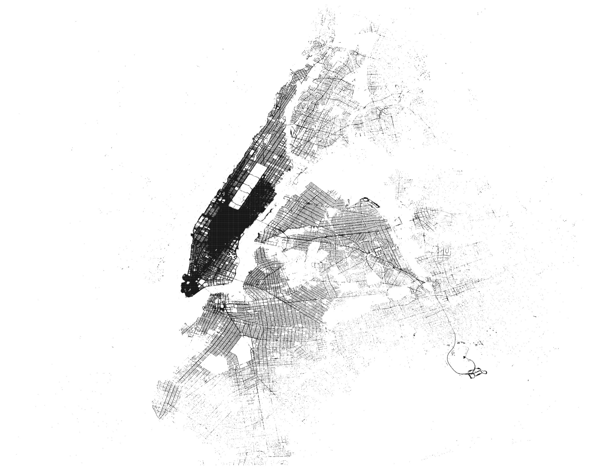
This yielded the following plot, which has an absolutely gorgeous amount of detail:

In contrast with the equivalent pickup plot, it demonstrates that people have much more varied destinations than starting points. But I wanted to do something different with pickup locations, so I spent a little while trying different ways to visually represent both frequency of pickups per location and the overall cost of each trip.
After a lot of experimentation, I gave up on more sophisticated techniques and decided to just scale things and bin them into a few color bands:
import matplotlib.pyplot as plt
import pandas as pd
from sklearn import preprocessing
# Human-friendly scaling
scaled = preprocessing.minmax_scale(pickups['total_revenue'], feature_range=(0,100))
# Bin the scaled data and assign color values
bins = [0, 1, 5, 10, 15, 25, 50, 100]
labels = [0, 8, 12, 14, 16, 18, 20]
scaled = pd.cut(scaled, bins=bins, labels=labels).astype('double')
fig, ax = plt.subplots(figsize=(30,24), dpi=200)
# Original boundaries
ax.set_xlim(-74.15, -73.70)
ax.set_ylim(40.5774, 40.9176)
# remove axis
plt.axis('off')
# remove margin
fig.tight_layout()
ax.scatter(pickups['long'], pickups['lat'], marker='.', s=pickups['num_trips'], c=scaled, cmap='hot', edgecolor='white', alpha=0.2)
display(fig)
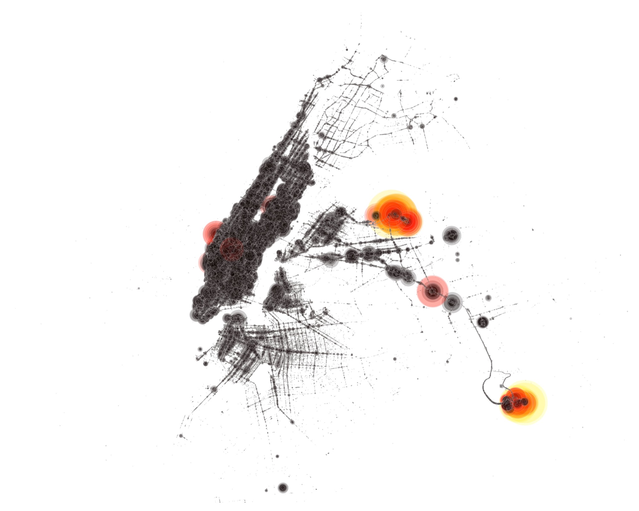
That yielded the following plot, which clearly shows both La Guardia and JFK airports (as well as what I suspect to be a mall in Queens) as being the most expensive pickup locations for cab rides outside Manhattan:

I love the way this looks–somehow, the bubbles remind me of Enki Bilal’s work.
There is much still to be done (and I expect to come back to this dataset in a later post), but I’m running out of time–and I haven’t even covered how to do DevOps with Databricks jobs yet!
-
One of my deepest fears is that Hive’s popularity in some circles might be solely due to it being covered in Hadoop tutorials. Thank goodness people make it past HBase, though. ↩︎
-
This is one of the reasons why the Azure HDInsight service is designed to run against storage external to the cluster. Another reason is that it is designed to be a volatile cluster service, to be brought up and down to run jobs as needed (but, alas, many people have trouble with ephemeral infrastructure). ↩︎
-
One of the most comprehensive, by the way, seems to be this one. ↩︎