Aside from a few bafflingly odd flaws like the Twitter sheet in the Notification Center failing to respond to the Enter key (it’s so 2002 to have to use the mouse to click on a “Send” button) and an annoying screen saver flaw (more on that later), the experience is pretty smooth and validates Apple’s approach at OS releases these days - iterative polish through and through.
I have to acknowledge that most of the changes so far make sense - as long as you were used to Lion anyway1 - and the only really annoying bit about the upgrade experience was the massive downloads required.
Even if, like me, you copy the installer to an SD card and use that to upgrade all your machines, you’re likely to have to download an extra 2-3GB per machine to update the iLife and iWork suites, not including any third-party updates or Xcode - both visible and invisible2 portions of it.
But hey, that’s progress.
So far, the tweaks I found of most practical use to me are:
- the upcoming calendar event panel atop Notification Centre (I used to rely on a hacked Dashboard widget to display those)
- Messages (yes, I like it. Don’t ask me why)
- the saner Calendar layout
- the Reminders app, which, despite lacking the sophistication of better tools, is dealing pretty well with my dozens of To-Dos3
- notifications
I won’t say much about the latter since they’re detailed to the point of idiocy in every review, but it’s worth noting is that I’ve already found myself wanting to switch off Growl notifications in just about anything I come across for the sake of consistency.
Sadly, Apple doesn’t allow non-Store apps to use the Notification Center in a sane way and the workarounds currently available don’t allow you to have custom icons in notifications, so it will probably take another year to sort out the whole mess - Until then, I’ve tweaked Growl to display stuff on a different corner and with a fairly similar look.
There were a few little disappointments along the same lines, though - stuff that Apple could have done better. For instance, I quite honestly found the VIP feature in Mail utter rubbish, largely because I have had a much better solution in place for a couple of years.
As far as I’m concerned, Apple missed a very important requirement for dealing with VIP correspondents: the ability to group mail sent to them along with mail from them.
Which is precisely what my “Current” smart folder does - it lists all messages from my inboxes and Sent Items folders and groups them all by conversation, showing me whole threads instead of showing me only half of what is going on.
The VIP feature is, however, useful to easily toggle notifications for specific people’s messages (no, you don’t need to set up a rule for those, it’s built in) - so I’m using it more as a “hotlist” than anything else, adding and removing people from the list.
On the whole, the VIP feature works much better if you think of it as a “I’m waiting for feedback from X” marker.
Finally, and to my annoyance, they broke screen savers.
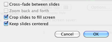
I realize being green is powering down your screen, but I happened to like having my photo collection displayed on my 4-monitor setup, Under Lion, starting the slideshow screen saver on my office machine put up four different images simultaneously, with photos resized to fit each individual screen.

It was simple, very light on the CPU with the settings shown alongside (all other screen savers perform relatively intensive animation) and quite soothing.
But, alas, the stock Mountain Lion screen savers have been dumbed down to the level of the Apple TV, and the configuration options were pretty much wiped out.
Not only that, but on my setup the screen savers insist on rendering the exact same photo on every display at once - and to add insult to injury, the option to have images centred on the screen is gone, leaving unsightly black bars on portrait and panorama shots.
Non-critical gripes like these apart, everything works. After reinstalling a few command line tools, I can run stuff. Compile stuff. Debug stuff. In a word, work, in pretty much the same way as I did before, and with subtle improvements.
Worth the upgrade? Well, yeah - it’s mostly what Lion ought to have been like, with a few extra niceties I’ll seldom use, a bunch of iCloud features that were long overdue (even if I’m not too keen on most of them), and better PIM features.
What’s not to like?
-
Of course, if you weren’t used to Lion, you’ll likely hate a number of visual tweaks. ↩︎
-
And then having to go into Xcode and setup the CLI tools to have git and the like, because even though they’re available separately, I cannot ever remember exactly where - fortunately I need Xcode anyway… ↩︎
-
I never really got into the “let’s use a load of third-party apps” mindset. ↩︎