Following yesterday's post (which resulted in a reasonable amount of Prototype and Python getting written, but not much useful functionality), I received quite a bit of feedback, among which there was a little gem called Tracks, which was pointed out by Jeroen and Emory in the comments.
Tracks is a nice Ruby-on-Rails-based GTD-oriented task manager that also happens to be multi-user, easy to install under Mac OS X and have a UI that is definitely not designed by a color-blind marmot - i.e., it is simple, makes effective use of color, and has a decent interaction pattern in which Ajax is actually useful, making for a pleasantly smooth user experience.
(It does require a bit more polish and I would probably reverse the UI layout, but it is, overall, pretty damn good - and you all know how critical I am about such things...)
I just got mine running using SQLite, and a friend reports it running successfully on his Intel iMac after following Apple's Ruby HOWTO and the installation instructions. Took me all of 5 minutes, and took him three times as long (roughly, since he didn't have Ruby installed).
Sidetracked
And boy, did I have fun with it. So much so that I completely forgot about skimming the news today, and decided to give it a bit more visibility - Tracks has more than enough documentation and steered clear of the usual mistakes in Open Source projects, but I couldn't find any screenshots of it, so I thought I'd post some as a way to give people an idea of what it does:
Welcome Screen
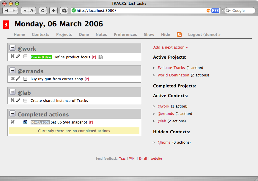
This is what it looks like after you log in (obviously, I added some data). Note the number of pending actions on the top left, the actions per context (which are collapsible) and the simple, intuitive action bar across the top. Show and Hide will show and hide all item notes, but the rest of the actions should be self-explanatory.
And in case you're wondering, the little red letters in front of an item let you jump to its parent (C)ontext or (P)roject easily.
Contexts and Projects
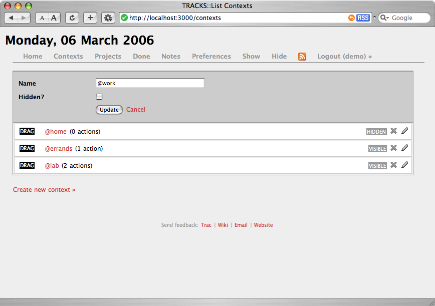
You can manage contexts and projects in exactly the same way. Projects have a description and an overall completion checkbox, but the basic interaction is the same - you can add, delete and rearrange either kind on a similar view.
Done
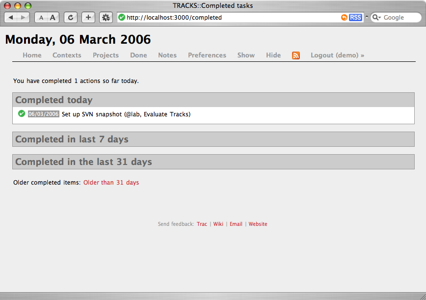
Here it is, the omnipresent progress report, already set up for you.
Preferences
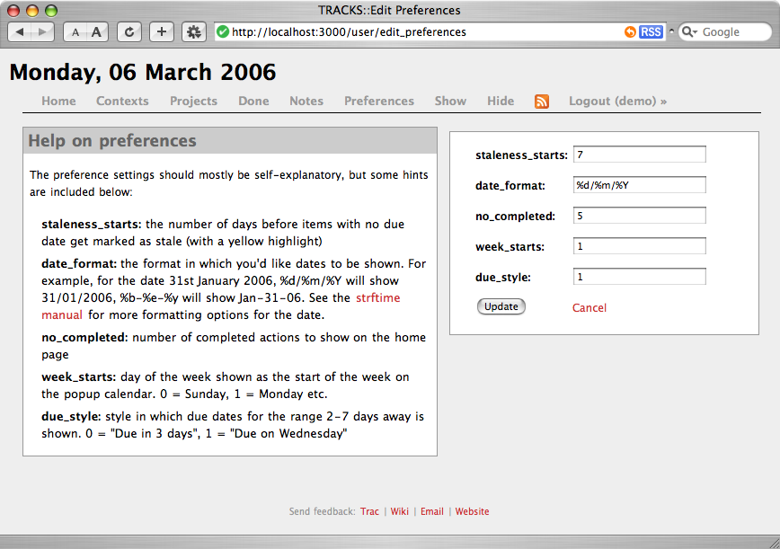
The preferences screen is simple and effective as well (there is also a separate screen to change your password). What I liked most was that, for a change, it has useful help text instead of just a cryptic dialog.
RSS Galore
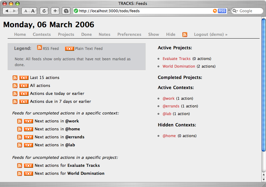
Although there doesn't seem to be any provision to share tasks (or any way to do delegation, collaborative project management, etc.), navel-gazing RSS junkies can get RSS and plain text feeds of, well, just about anything in Tracks. Although there is no mobile interface, this might be enough for most people...
Adding an Action
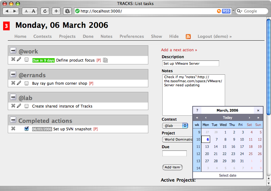
Obviously, you can use Textile in your notes for any item, and you get a nice pop-up calendar (that might need some paring down in terms of real estate) when you need to fill a date field. And, of course, it all works with Ajaxy magic, instantly updating the page:
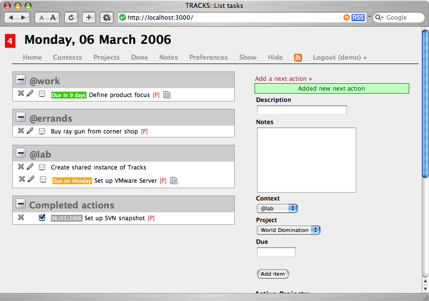
So, Why Don't I Use It, Then?
Well... For no reason, actually, although I was quite keen on having a mobile interface. So I am going to use it for a while, figure out what I really want from a GTD-oriented task manager, and keep my own project in the back burner for now.
I do know I want file-based storage (probably encrypted) and that I would vastly prefer to have something of my own that I could bend and twist at my whim (probably even folded into Yaki), but Tracks is precisely the kind of neat, simple UI that suits my current needs.
Time will tell if it will work for me in the long run, but It has something of a Backpack/37 Signals feel about it, and I think that is the best possible compliment I can give it right now.
Definitely recommended.