Spent a good portion of the afternoon walking a mile in the shoes of the average Joe - i.e., getting brainwashed by watching mindless TV, a course of action that would have skirted dangerously close to utter boredom were it not for the first two movies of the Star Wars saga.
Which, despite the vast numbers of wide-screen TVs sold every year, were shown maimed in 4:3 format, standard stereo and utterly clueless subtitling for the sake of drumming up mind-share for the Revenge of The Sith Marketeers - sure to pack every movie theatre next week.
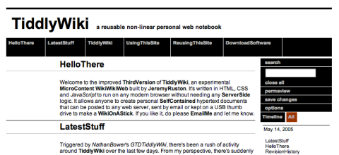
After diddling around with GTDTiddlyWiki and its forefather for an hour or so trying to hack their CSS to achieve even a pale echo of the pure sparseness of Subtraction, I came up with a moderately interesting result (scaling fugdes the lines a bit - it's all black, no greys):

Sadly, I somehow mucked up zooming and editing (the fields were mis-placed) and couldn't figure out how to display item dates alongside the titles in under 15 minutes, so I called it quits for now. But you gotta love the way Khoi Vihn's minimalist design enhances readability.
Hint: To all TiddlyWiki hackers out there: Please stop "improving" your variants with garish colors - less, as always, is more.
My needs for moderately creative brain activity having been met, I gradually progressed to watching canned TV on DVD, which is, as always, a slightly more satisfactory course of inaction - if only because I can switch off the subtitles.
Something at the back of my head has already re-designed my new Wiki back-end, drafted an agenda for this week's first three meetings and ran the numbers on a couple of feasibility studies, but I can safely ignore that until I need any of those things handy.
You gotta love it when your brain works for you while you relax.