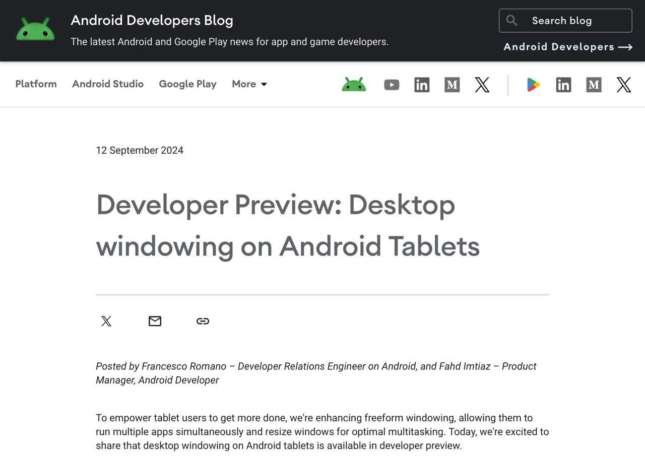
I just realized that this is happening, and that they’re effectively going to (finally) Sherlock DeX, although Android apps have a very steep hill to climb before they stop looking like crap on tablet devices–let alone full-size monitors.
However, the real test will be how developers adapt their apps to take full advantage of this feature. The guidelines seem straightforward, but we all know that “adaptive layouts” can sometimes be a euphemism for “we’ll see how it goes.”
Still, it’s a promising start, and I’m curious to see how it evolves in the wild.
