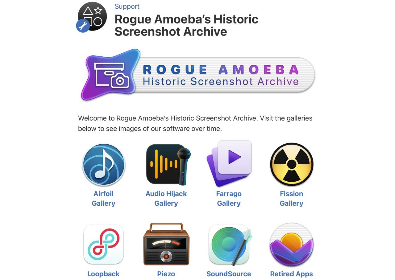
Today’s nostalgia rabbit hole, and a timely reminder that the desktop experience has pretty much gone steadily downhill throughout the history of macOS.
I still own a hard copy of Bruce Tognazzini’s “Tog on Interface”, and every now and then I leaf through it to remind myself of how it was when intuitive UI design was a priority rather than an afterthought.
Although we blame the web and shitty Electron apps for the recent downturn in overall computer usability, it is sobering to go over these screenshots and notice that the erosion of clarity and usability on the Mac actually started with Apple itself as it progressively sanded down the macOS UI into featureless rounded rectangles laden with ambiguous text that (lacking affordances) might or might not be buttons and drop-downs.
Rounded rectangles everywhere, as far as the eye can see.
