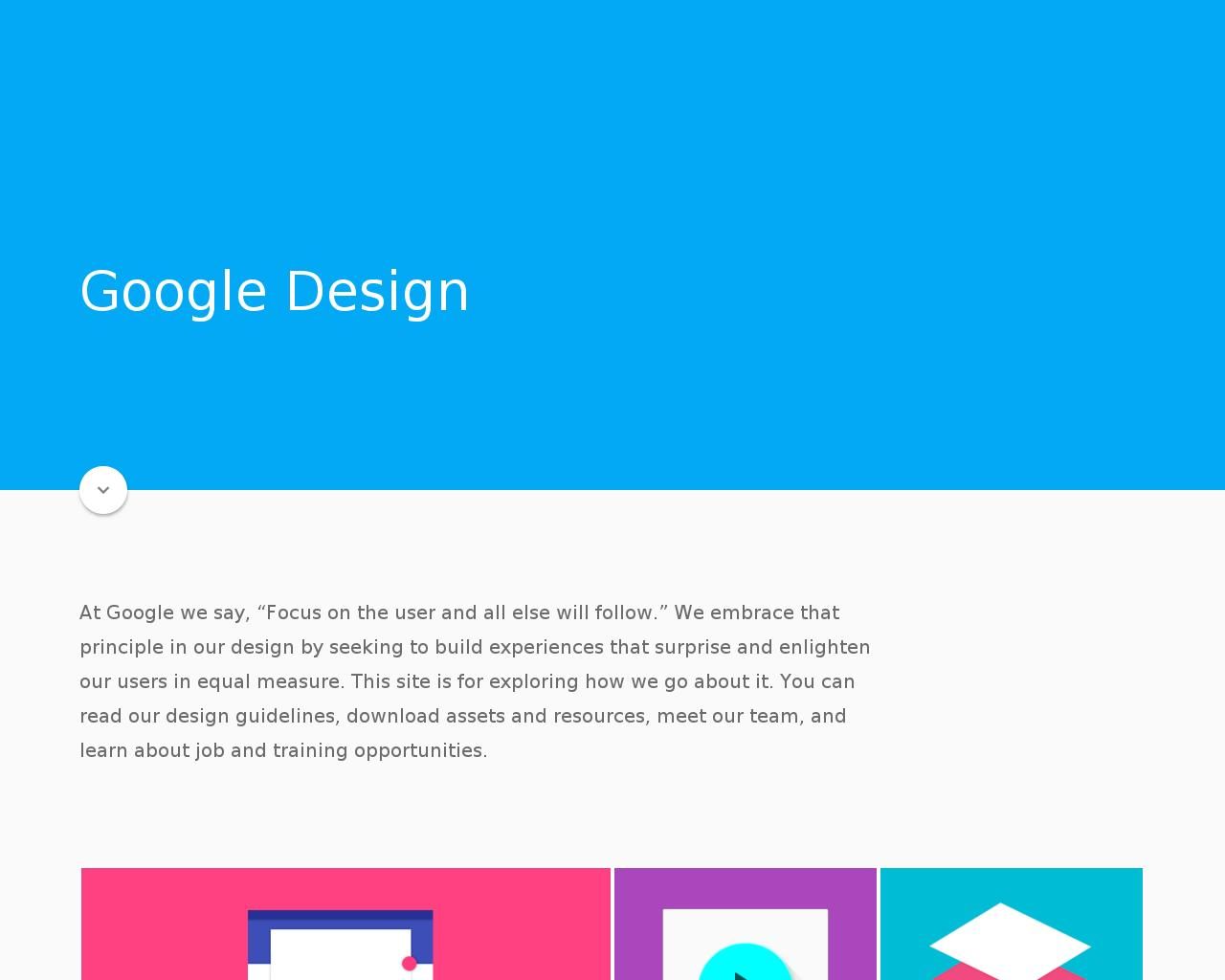
So they’re taking the Holo look and cramming a bunch of primary colors into it. Flatness with depth, as one of my friends put it. Still, it might actually improve the look of most Android apps, and help build some consistency with Chrome OS. But it feels a lot like dumbing down the native look to match the web’s limitations.
