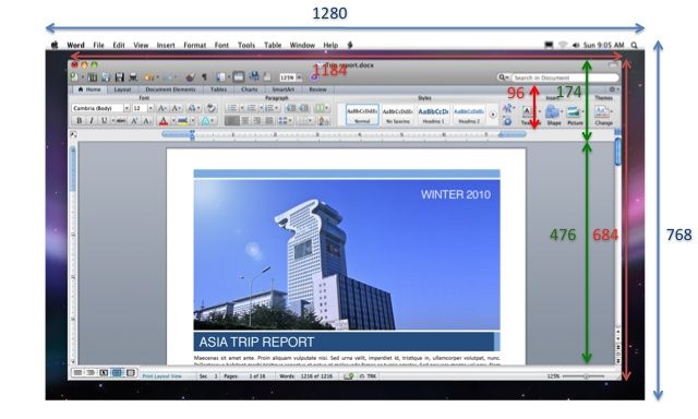
The problem with the ribbon UI (and you can see that clearly in the screenshot) is that it squeezes your work area vertically - a bad thing when screen aspect ratios tend to lean to the wide side, and one of my biggest annoyances when I use Windows on modern laptops (including netbooks, where it’s just ludicrous).
Update: So much so, in fact, that I’ve gone and worked out how much screen real estate you lose from it vertically (over a quarter of the default window size). And you’ll notice there’s no Dock on that screenshot…
