 Rui Carmo
I haven’t written much of anything about Azure over the past year or so, other than assorted notes on infrastructure provisioning (to which I will get back, now that Terraform has an updated provider), nor about machine learning and data science–the former because it’s not a very sexy topic, and the latter because most machine learning in real-life boils down to a lot of data cleaning work that is hardly reflected in all the pretty one-off examples you’ll see in most blog posts.
On the other hand, sometimes there are neat things you can do in the outlying regions of either field that end up being quite useful, and this is one of those (at least as far as I’m concerned), since it’s essentially a sanitized version of a Jupyter notebook I keep around for poking at my personal Azure usage, since even though I use PowerBI about as extensively as Jupyter the former is not available for macOS, and I quite enjoy slicing and dicing data programmatically.
Even though there are now fairly complete Azure billing APIs that let you keep tabs on usage figures, the simplest way to get an estimate of your usage for the current billing period (on an MSDN/pay-as-you-go subscription, which is where I host my personal stuff) is through the Azure CLI.
In particular, az consumption usage list, which you can easily dump by resource category like this:
! az consumption usage list -m -a --query \
  '[].{category:meterDetails.meterCategory, pretax:pretaxCost}' \
  --output tsv > out.tsv
This is, of course, a fairly simplistic take on things (I’m not setting start or end periods and am actually only getting the category and cost for each item), but you get the idea.
With the data in tab-separated format, it’s pretty trivial to build a total and do a rough plot. Let’s do it in more or less idiomatic Python, and rely on pandas solely for plotting:
from collections import defaultdict
import pandas as pd

c = defaultdict(float)

for line in open('out.tsv').readlines():
    category, pretax = line.split('\t')
    c[category] += float(pretax)

pd.DataFrame.from_dict(c, orient="index").plot(kind='bar',grid=True,legend=False);
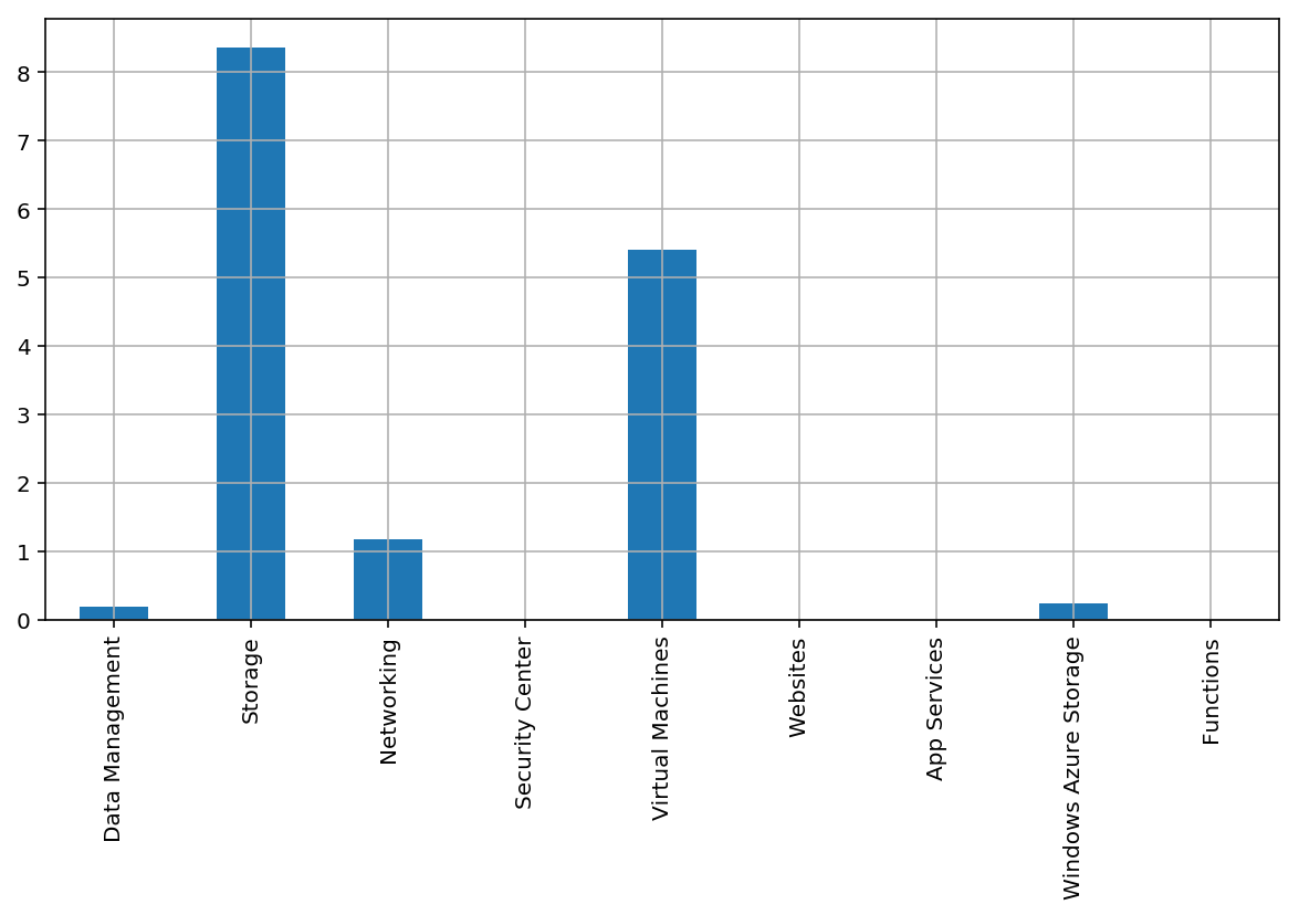
As you can see from the above, I spend very little on VMs. But I know that VM storage is tallied separately from compute, and my Synology NAS backs up regularly to Azure blob storage (using the “cool” storage tier, something I’ll write about some other time), so most of my costs are actually related to storage.
But what’s that Windows Azure Storage category? Well, I know it is a hang-over from eariler times that is tied to disk I/O, but let’s take a better look at that with a nicer DataFrame:
! az consumption usage list -m -a --query \
  '[].{name:instanceName, category:meterDetails.meterCategory, \
       details:meterDetails.meterName, pretax:pretaxCost, \
       start:usageStart, end:usageEnd}' \
  --output tsv > out.tsv
As you can see, this grabs a lot more detail. Let’s load it up by taking full advantage of pandas, and then take a look at that category to see the details:
df = pd.read_csv('out.tsv',
                 sep = '\t',
                 names = ['name', 'category', 'details', 'pretax', 'start', 'end'],
                 parse_dates = ['start','end'])

df[df['category'] == 'Windows Azure Storage'][:5]
| name | category | details | pretax | start | end | |
|---|---|---|---|---|---|---|
| 59 | services747 | Windows Azure Storage | Standard IO - Page Blob/Disk (GB) | 0.018789 | 2018-05-20 | 2018-05-21 |
| 60 | 5a1889westeurope | Windows Azure Storage | Standard IO - Page Blob/Disk (GB) | 0.000002 | 2018-05-20 | 2018-05-21 |
| 123 | services747 | Windows Azure Storage | Standard IO - Page Blob/Disk (GB) | 0.018789 | 2018-05-21 | 2018-05-22 |
| 124 | 5a1889westeurope | Windows Azure Storage | Standard IO - Page Blob/Disk (GB) | 0.000002 | 2018-05-21 | 2018-05-22 |
| 187 | services747 | Windows Azure Storage | Standard IO - Page Blob/Disk (GB) | 0.018789 | 2018-05-22 | 2018-05-23 |
Yep, it’s disk I/O, alright.
The first thing that is neat about this approach is the way it lets us re-visit the plot we did earlier:
df.groupby('category').sum().plot(kind='bar',grid=True, legend=False);
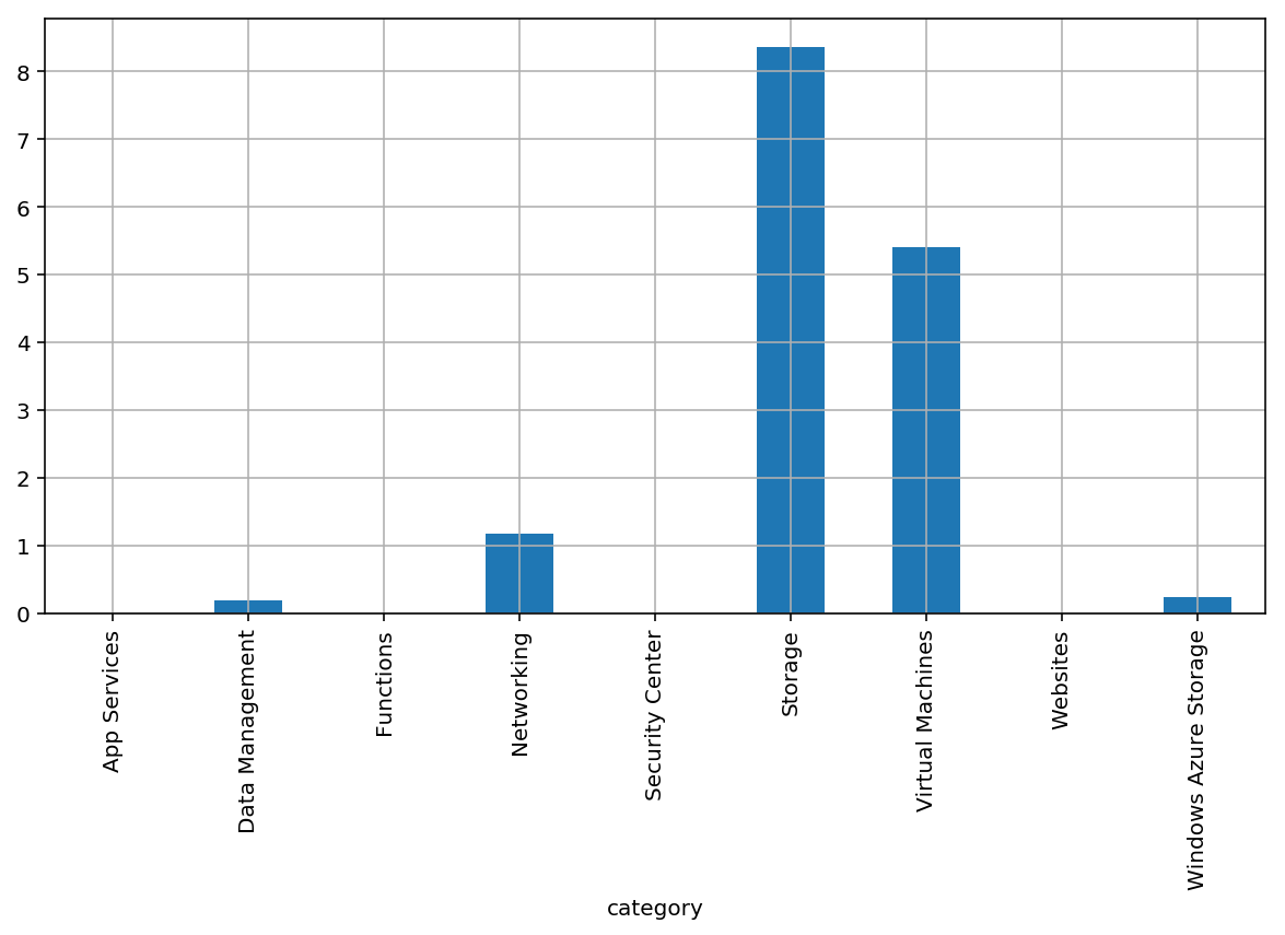
The second thing is that I can now slice and dice the entire dataset with ease.
Let’s take things up a notch, then, and figure out how much a given set of resources is going to cost–in this case I’m not relying on resource groups (I’d have to parse them out from the instanceId field, which I didn’t request), but I can enumerate the specific resources I want and group the amounts by the relevant attributes.
So here are the core resources for this server (discounting diagnostics, automation, and a bunch of other things for the sake of simplicity):
df[df['name'].isin(['tao',
                    'tao-ip',
                    'tao_OsDisk_1_13dad9b4ede34cc1a694cf79c6d048f1'])] \
    .groupby(['category','details','name']).sum()
| pretax | |||
|---|---|---|---|
| category | details | name | |
| Networking | Data Transfer In (GB) | tao | 0.000000 |
| Data Transfer Out (GB) | tao | 0.144388 | |
| IP Address Hours | tao-ip | 0.986324 | |
| Storage | Premium Storage - Page Blob/P6 (Units) | tao_OsDisk_1_13dad9b4ede34cc1a694cf79c6d048f1 | 3.606732 |
| Virtual Machines | Compute Hours | tao | 5.410875 |
This kind of grouping, coupled with pandas filtering, also makes it trivial to plot out resource costs over time in various dimensions:
group = df[df['name'] == 'tao'].groupby(['details'])

# tweak plot size
import matplotlib.pyplot as plt
plt.rcParams["figure.figsize"] = (10,3)

# Use the 'end' timestamp for each usage record as reference
group.plot(x='end', y='pretax')
details
Compute Hours             AxesSubplot(0.125,0.125;0.775x0.755)
Data Transfer In (GB)     AxesSubplot(0.125,0.125;0.775x0.755)
Data Transfer Out (GB)    AxesSubplot(0.125,0.125;0.775x0.755)
dtype: object
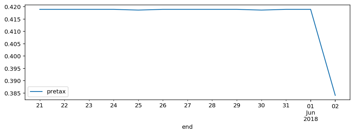
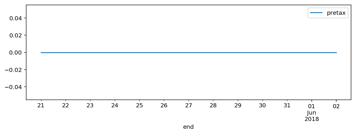
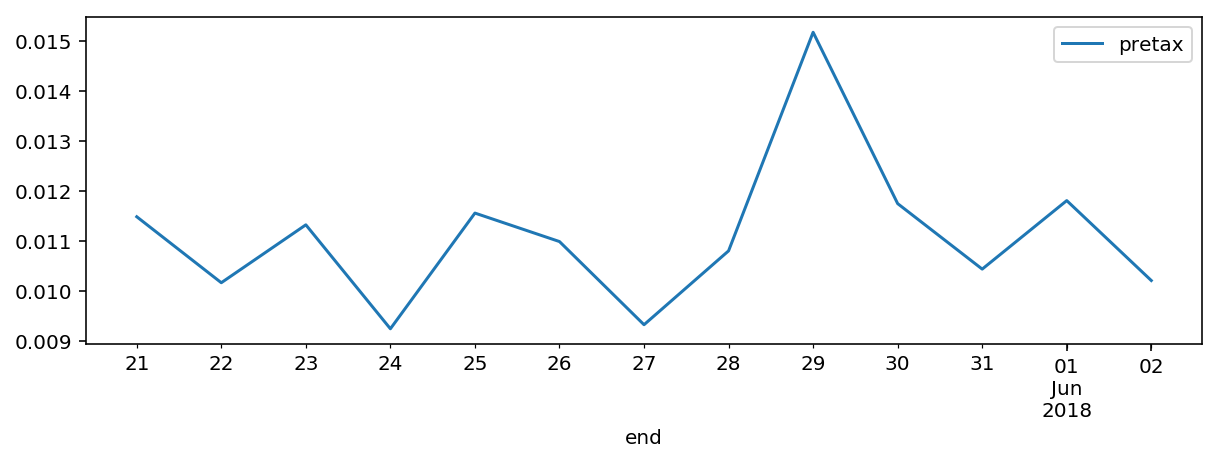
From the above, it’s easy to see that compute costs fluctuated very little (little more than a sampling error, really), inbound data is free (as usual), and I had a little bit more traffic on the 29th, likely due to this post, which I had already noticed to be a bit popular.
Nothing I couldn’t have gotten from the Azure portal, really, and doing this for my personal subscription is completely overkill, but when you have beefier billing data, doing this sort of exploration is a lot more rewarding.
I’ll eventually revisit how to go about doing this directly via the REST API (nothing much to it, really, and you can see for yourself how az does it by adding --debug to the commands above).
I have a few more things I’d like to write about regarding both infra provisioning and data science, but time’s always short…