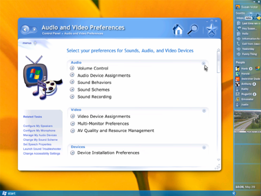
While browsing through Paul Thurrott's SuperSite for Windows, I came across a link to the new Aero UI and the picture above.
Notice the rounded window corners, the soft drop shadow, the subdued metallic look, and the largish (but vertical) dock. Look familiar? OK. Now take note of the heavy emphasis on window "eye candy" and Quartz-like animations.
There's a growing gallery, and of course the images are of a beta product (one which uses BeOS icons - try to spot the "three cubes" icon on the pictures...), but every time I look at Longhorn these days I see more and more Mac OS X.
Maybe it's me. Maybe I was the only one who noticed the way Windows 95 mimicked the Mac desktop, but with the icons aligned to the left.
Spot the differences.